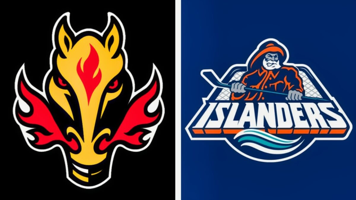
The factors that go into designing a logo for a professional sports team are numerous. Nowadays, organizations pay large sums of money to companies to design them. Sometimes a team’s classic logo is timeless (think Maple Leafs), other times teams make changes to their logo, with varying results. With the invention of alternate jerseys, some organizations have several options to choose from before they take the ice.
It’s often said that clothes can make a man, but sometimes a bad jersey can make a hockey player look ridiculous. Let’s take a look at 10 Oddest Jersey Logos In NHL History.
Calgary Flames – Alternate Jersey, 2003-06

The history of the Calgary Flames logo has been a mixed bag. Their current look, the red C with trailing flames, is a classic-looking logo. Through the years the Flames have attempted several alternate jerseys, but it seems that the alternate jersey from 2003-06 is the worst. The coloring of the jersey is not bad, black with the bottom of the sleeves and body red with a yellow stripe, but the actual logo makes no sense. It’s a devilish-looking horsehead snorting red flames. Looking at the logo gives no indication that the team’s name is the Flames. A logo should reflect the team, and the 03-06 jersey simply doesn’t accomplish that.
Vancouver Canucks – Regular Uniform, 1978-86

This uniform was more of a design than a traditional logo. It looks more like an ugly sweater that your uncle would wear to an early ’70s Thanksgiving gathering rather than something a hockey team would wear. The yellow jersey with the extended red and black V-neckline was just ugly. Sadly, this would not be the only horrible logo/jersey used by the Canucks, but it is the absolute worst they’ve ever worn. It’s a good thing that Vancouver ditched these before the creation of the internet, and many fanbases only had to see this uniform once a year.
Anaheim Ducks – Current Logo

Click on ‘Follow Us’ and get notified of the most viral NHL stories via Google! Follow Us
The only current logo on our list, the Anaheim Ducks would be wise to make another uniform change. Their current logo looks more like a combination of the letter D and Batman’s emblem than the webbed foot it’s supposed to be. Anaheim should go back to one of their other past logos more reflective of a duck. I’d suggest their original emblem, the duck-billed goalie mask over crossed hockey sticks. Honestly, almost any other logo would be better than the current one.
California Golden Seals – Primary Logo, 1967-1976

The Golden Seals had a short existence in the National Hockey League, only lasting 10 seasons before moving to Cleveland. They were rebranded as the Barons but ceased operations entirely in 1978. Back to the Seals. While many complain about the green and yellow color combination, that really isn’t the main problem. The main issue lies in whatever creature is depicted in their logo. It’s supposed to be a seal but does not look that way. The late 1960s was an interesting time in the Bay Area, but it does make one wonder what the creator of the Seals logo was on when he designed it.
Phoenix Coyotes – Alternate Jersey, 1998-2003

It seems like hockey in Arizona might’ve been a mistake. The Coyotes have moved arenas several times, have had a history of drawing fans, and financial problems. It certainly hasn’t helped matters that the Coyotes have had one of the dumbest logos in NHL history. Their alternate jersey looks like a cross between a Native American pictograph and a Picasso painting. The abstract design and multiple colors just don’t work together and create an eyesore. It’s unfortunate that this logo lasted for 5 seasons when it never should’ve been used for 5 games.
Los Angeles Kings – Alternate Jersey, 1995-96

It’s really hard to fathom Wayne Gretzky wearing this atrocious uniform, but for one long season, he and the rest of the Kings did. Honestly, there were a couple of options for Los Angeles on our list. Their purple uniforms certainly deserved consideration, but their 1995-96 alternate jerseys earned the nod. Often referred to as the Burger King jerseys, this look just didn’t work. The king logo looks less like royalty and more like Skeletor from the old He-Man cartoon. Los Angeles was wise to ditch this horror show after just one season.
Columbus Blue Jackets – Alternate Logo, 2000-04

The Columbus Blue Jackets certainly deserve a spot here, as their alternate logo was one of the worst. The nickname Blue Jackets was created to refer to the blue jackets that Ohio soldiers wore during the Civil War. It’s admirable to honor the state’s history and the sacrifice of those who served, but the logo just makes no sense. It’s some type of insect with bulging red eyes. It seems like they were trying to combine the history of the Blue Jackets with a yellow jacket. Just pick one Columbus.
Dallas Stars – Alternate Jersey, 2003-06

It’s often said that everything is bigger in Texas, and that would include mistakes. Whoever designed this logo should’ve been fired from their job and run out of the NHL. Simply put, what were they thinking? It’s understandable that an organization would want to honor the team’s history and state where they play, but this logo goes too far. The emblem looks less like a Texas longhorn and more like part of a woman’s reproductive system. “Mooterus” was a completely appropriate nickname for this dumb logo.
NY Islanders – Fisherman Logo, 1995 – 1997

“We want fish sticks” clap, clap, clap, clap, clap, “We want fish sticks”. For 2 seasons in the late ‘90s Islanders players were often greeted with that chant, especially at the hands of rival Rangers fans. But the reality is that the Islanders deserved every bit of verbal abuse for those horrid jerseys. It’s certainly understandable that the Isles wanted to honor the fishing tradition of Long Island, but there was absolutely no need for the Gorton’s Fisherman logo, especially when their classic logo was so good.
Montreal Canadiens – Throwback Jersey, 2009

The Canadiens are the New York Yankees of the NHL, with a league-leading 24 Stanley Cup championships and a long, decorated history. That includes having one of the classiest logos in the league. However, in 2009 the Habs unveiled a throwback jersey that is easily the dumbest and ugliest logo in hockey history. The red, white, and blue horizontal stripes made the players look like prisoners in clown college. Fortunately, the Canadiens ditched the uniforms after just one season, but the damage was done, and these are simply the worst ever.


