All 32 NFL teams logos ranked based on how intimidating they are…
When it comes to designing a sports logo, there are countless directions for the artists to go: Do you want to tie in the history of the city slash state the team is based in? Do you just throw a bunch of colors together and hope they stick? Or do you try to make it fierce and intimidating to the opponents?
One of the above categories applies to most NFL teams. But in terms of strictly the intimidation factor, how do all 32 logos stack up against one another? That’s what we’re here to solve, so let’s get right into it.
32. Washington Commanders
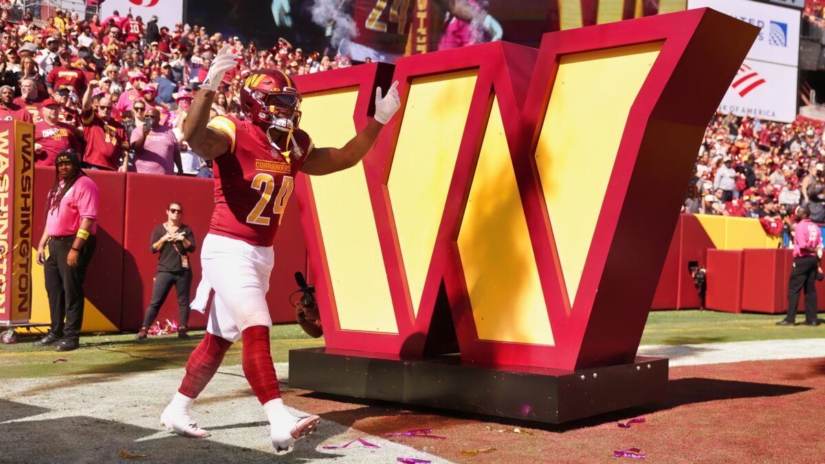
With the “Commanders” team name, Washington had countless avenues to creativity with their logo. But rather than implement a Commander or something menacing in their logo…they went with the simple “W”.
Yay. How unlike anything we’ve seen before. Literally a letter. You couldn’t tie in a commander or something else football-related in there? Of course not. It’s a team Dan Snyder owned for 23 years. This team never did anything right under his watch.
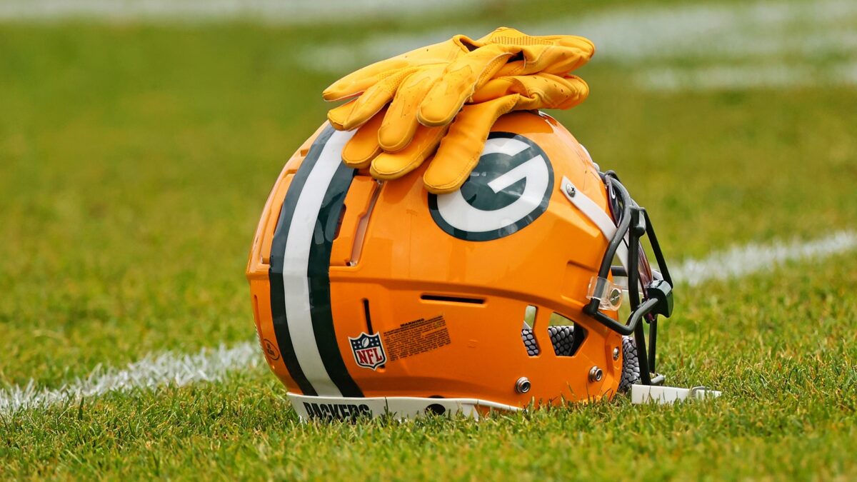
31. Green Bay Packers
Click on ‘Follow Us’ and get notified of the most viral NFL stories via Google! Follow Us
Not at all here to complain about the Packers’ logo, team name or jerseys. They’re among the most iconic in American sports. But from an “intimidation” standpoint, there’s truly nothing scary about a simple “G.”
If anything, the green and yellow colors around the white G give it a more welcoming and comfortable look, if you will.
30. Chicago Bears
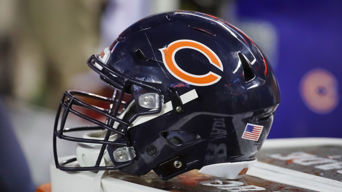
If the Bears used their alternate logo — you know, a real bear — they’d be in the top five on this list. But instead, the Bears have continued using the good ol’ boring orange-colored “C” as their main logo.
A reminder that the name “Chicago” starts with the letter “C.” The Bears play in Chicago, hence why they have a “C” as their logo instead of the intimidating and ferocious creature. At least the team name rocks!
29. New York Giants
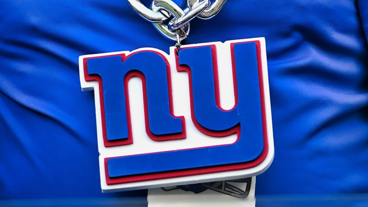
It’s one of the most common names in sports, but we don’t have an issue with the “Giants” team name. It’s just, why do the Giants also have to be one of those teams to use their city initials as the main logo?
The Giants were an intimidating force in their Super Bowl winning days with the likes of Lawrence Taylor, Michael Strahan, Justin Tuck and Osi Umenyiora. Those were one-man wrecking crew pass-rushers that single-handedly took over games and propelled Big Blue to a combined four Super Bowl titles.
28. Cleveland Browns
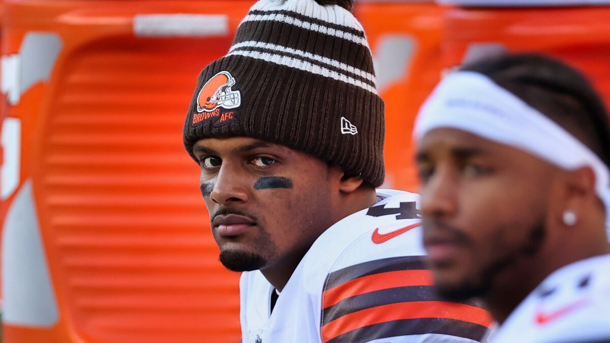
If the Browns used their alternate logo of the dog, they’d also be higher on this list. But nope! No bother. They’re more than content to use the bland logo of an orange-colored football helmet.
Since the Browns play football, they use a football helmet. Thanks for the reminder about which sport you play, Browns’ organization. Your play on the field has been awful since 1999, but at least the on-field product is more intimidating than the helmet logo.
27. San Francisco 49ers
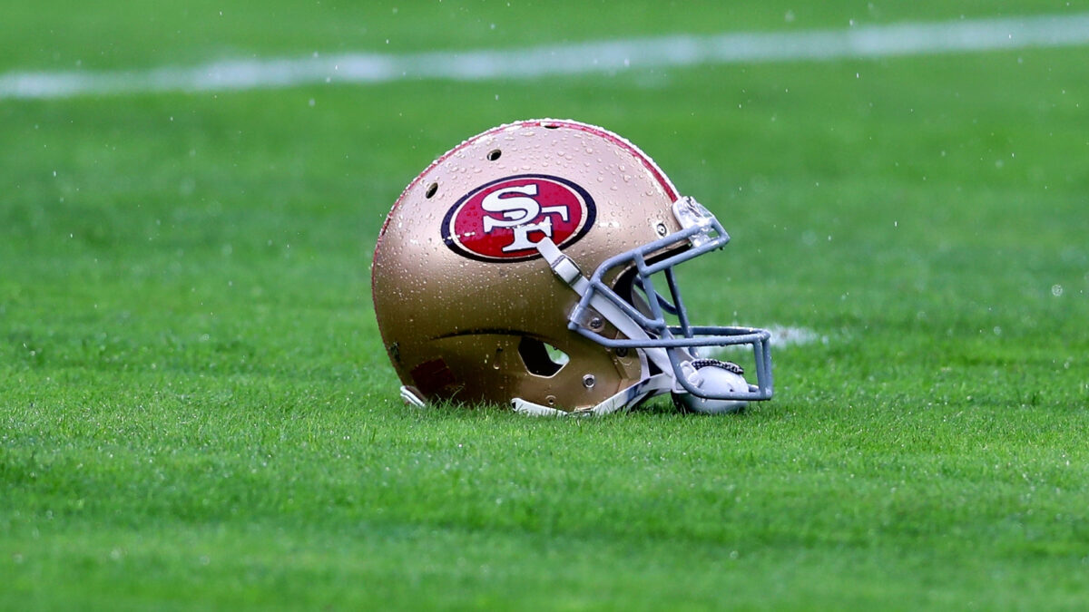
Yeah, we know. Another logo that simply shows the 49ers’ initials of “SF.” Not exactly flattering.
What we do like is how the “SF” is placed in an oval-shaped-like football. At least they were able to use a little bit of creativity on that front. And the color schemes are simply nicer than the logos that rank below the 49ers on this list.
26. New Orleans Saints
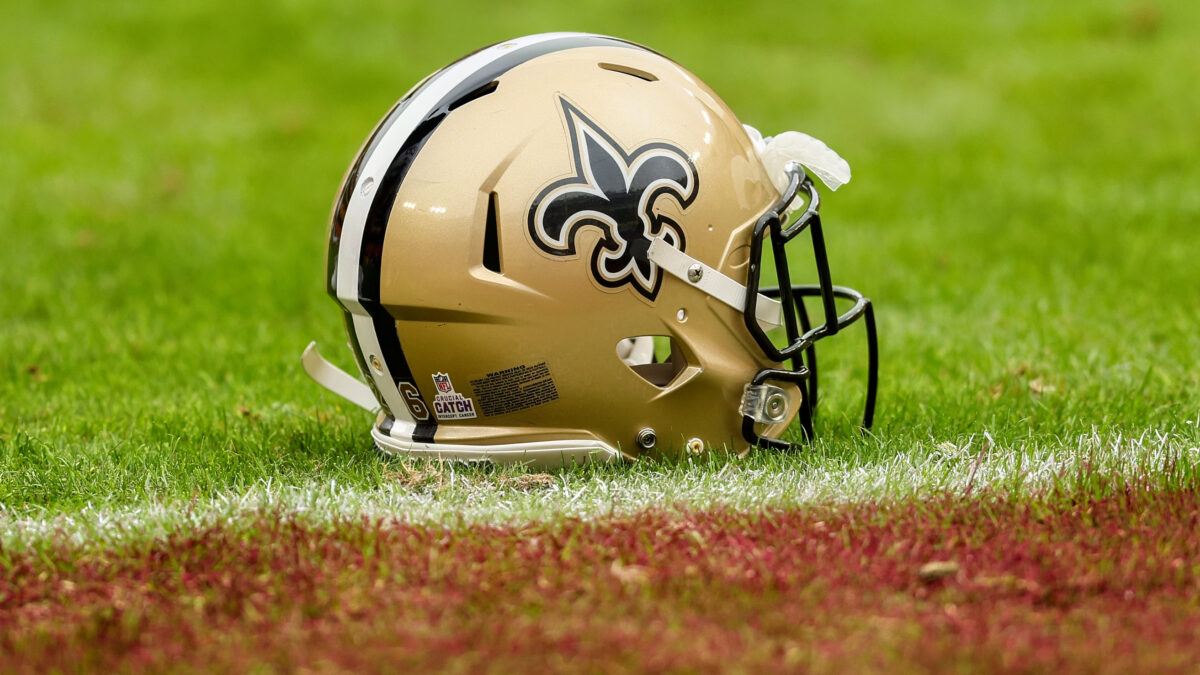
We absolutely love the team name “Saints”, and their jersey colors will always rank among the very best. But when your team name is as comforting as “Saints”, you’re not exactly going to have the intimidation factor in your logo, now are you?
25. Indianapolis Colts
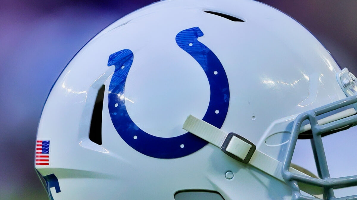
Hard to make a logo scary-looking when your team name is the “Colts.” Robert Irsay opted to keep the original team name intact after relocating the franchise from Baltimore in 1984.
But hey, at least the logo is a horseshoe. Way better than a simple “I” or “C” letter as the logo. That said, it’d be cool if the Colts used their old logo and implemented a fierce-looking horse of some kind to complement the horseshoe.
24. Miami Dolphins
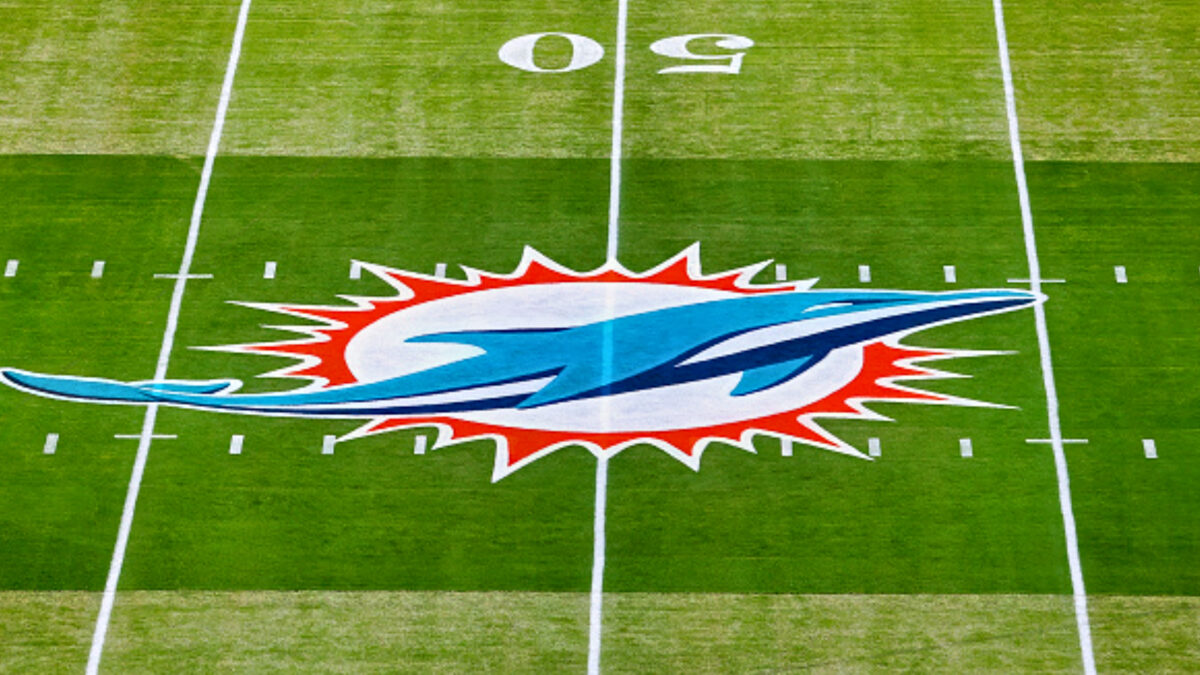
A dolphin isn’t exactly the most intimidating creature. They’re beautiful creatures and well-known for being super-friendly to humans. But the football team here did a good job of making their creature look a little more fierce.
Their previous logo of the smiling dolphin with the helmet certainly wasn’t intimidating, but it was adorable.
23. New York Jets
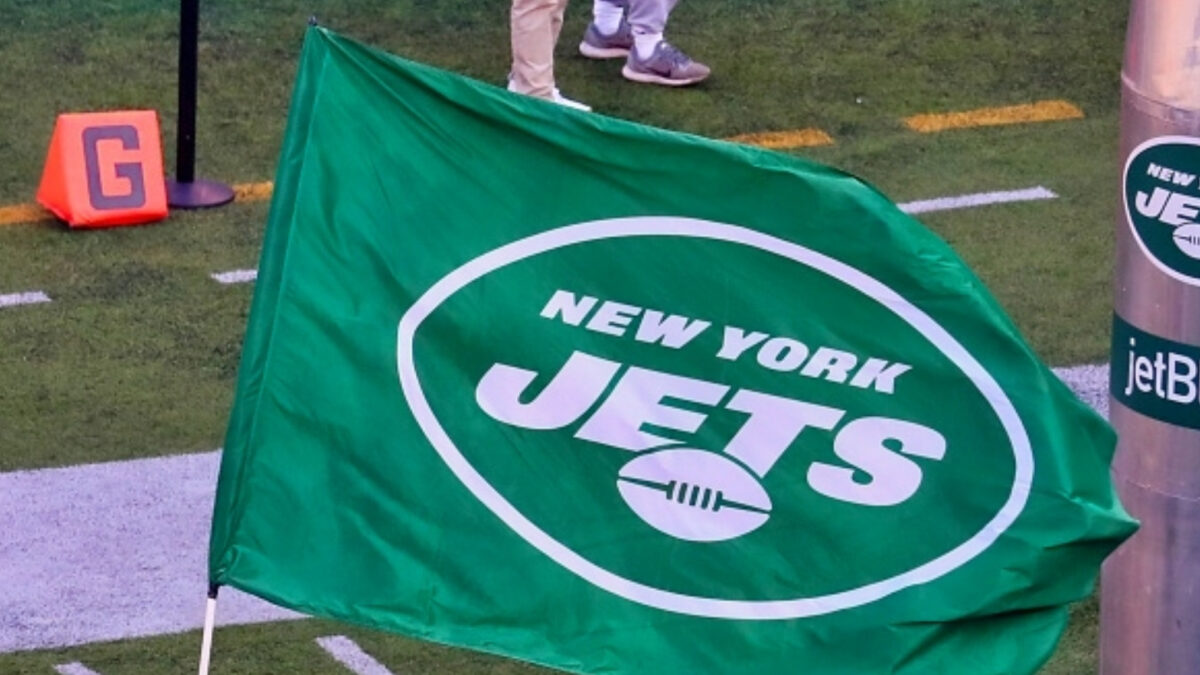
Nothing overly intimidating about a green/white logo that says “New York Jets” on it. But at least the Jets were able to implement a football inside a football-shaped-like oval. Bonus points for being a little more creative there.
22. Cincinnati Bengals
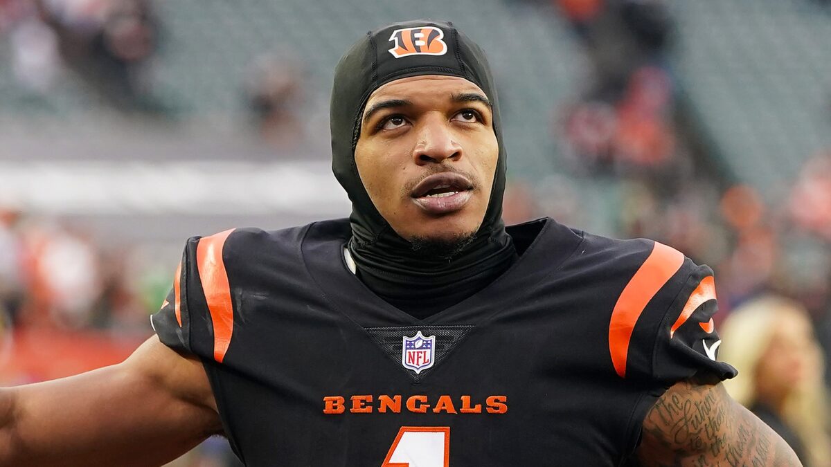
You see, unlike the other teams that use a letter as their primary logo, the Bengals actually got artistic with theirs. They have the bengal-striped pattern in their B, and that at least offers a nice reminder of the intimidating creature.
Granted, the Bengals would be in the top-10 on this list if they used the old logo of the angry-looking bengal. But at least they put some thought and creativity into making the B cool-looking…
21. Dallas Cowboys
It’s simple yet so iconic and historic. The Cowboys’ white-blue star is one of the most universally-recognized sports logos, and we can only hope that the Jones family will never consider changing it.
We can’t say the Cowboys logo carries much of an intimidation factor. But the team name speaks for itself, so why bother getting overly fancy and cute with the logo? It’s just fine as is.
20. Pittsburgh Steelers
Like the Cowboys, the Steelers have one of the most recognizable and beloved logos in sports. It’s not exactly intimidating, but the Steelers will always win points with the bright colors and unique designs.
Plus, the name “Steelers” kind of sounds intimidating itself. Steel City. Nobody wants to get hit by steel, either. And the Terrible Towel and rowdy atmosphere at Acrisure Stadium are intimidating enough. The Steelers needn’t worry about how scary their logo looks.
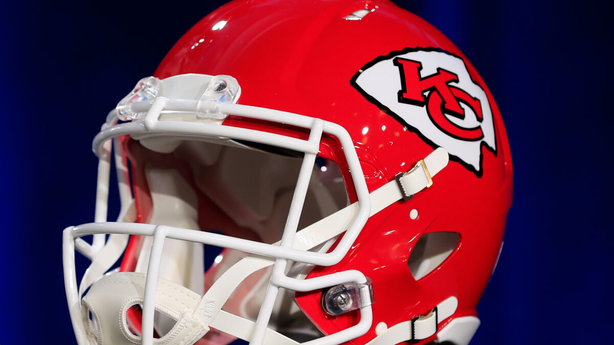
19. Kansas City Chiefs
This organization was initially based in Dallas and used the name “Texans” from 1960 to ‘62 before relocating to Kansas City in 1963.
The design and colors of the “KC” logo are done nicely here. And if you look closely, you’ll see that the shape is that of an arrowhead. It’s a sneaky-creative way of designing the logo, not to mention they also play at Arrowhead Stadium!
18. Tennessee Titans
You’d think with a team name “Titans”, the organization would have a more scary-looking logo. But the navy, turquoise and red-colored flames are kind of campy and don’t at all look realistic.
The “T” in the circle at least has a nice touch. Honestly, silver and black instead of turquoise and navy would make this logo look better than it really is. The cartoonish colors are a bigger problem than the logo itself.
17. Las Angeles Rams
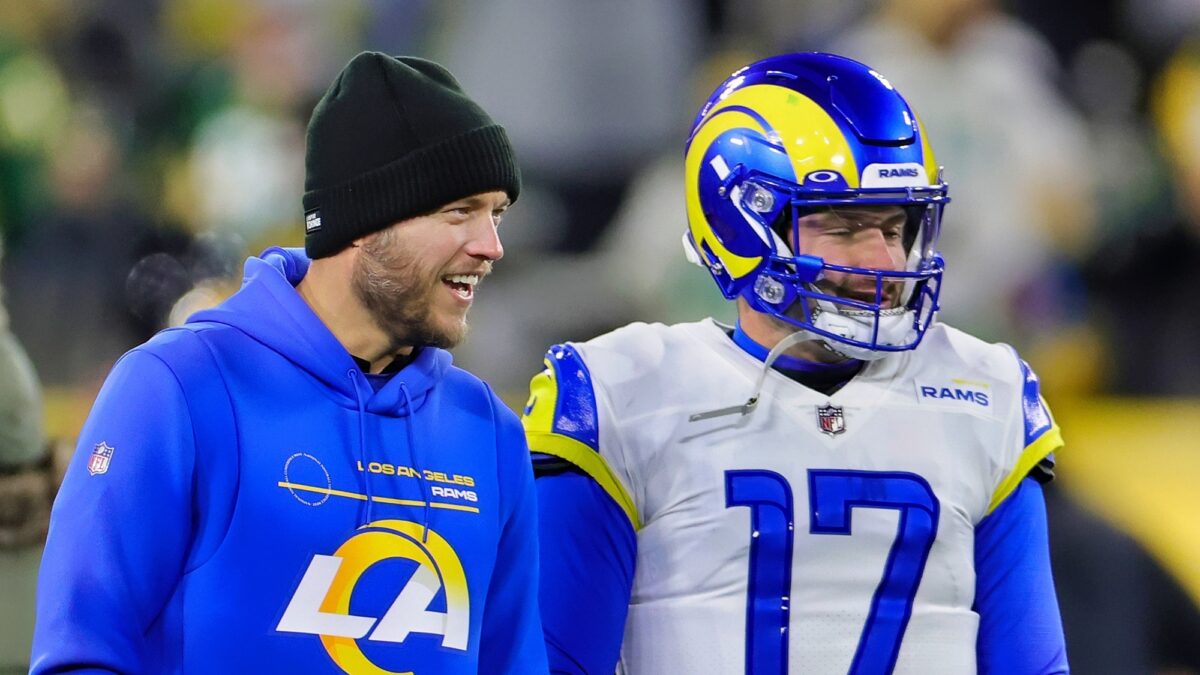
The Rams’ previous logo would have placed them much closer to the top 10. The name itself is just perfect for a football team, considering that the game itself features plenty of ramming-into-other-players.
The Rams’ current logo was met with widespread criticism, and we still don’t like it as much as the last. But at least they were able to tie in the ram horns into this logo, adding a small sprinkle of intimidation into it…
16. Houston Texans
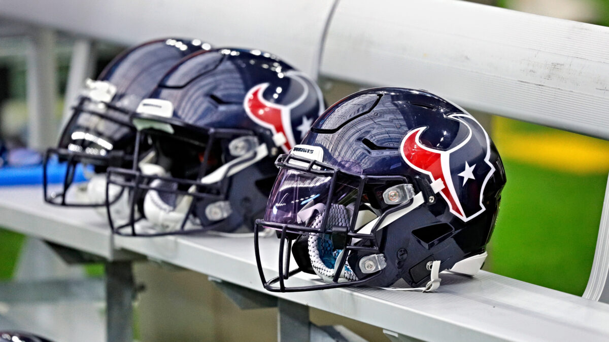
The Texans definitely have one of the most uncreative and boring team names in sports. You don’t see the Rams or Chargers naming themselves the “Californians” nor the Bengals or Browns naming each other the “Ohioans.”
But the Texans’ make up for their boring team name with a slick logo and a nice color scheme here. We definitely dig the bull’s head here, which has a nice nod to the wildlife there in the Lone Star State.
We’ll add this: The logo would be a little scarier looking if they gave the bull some eyes and a mouth.
15. New England Patriots
The so-called “Flying Elvis” logo has taken its fair share of heat, but we don’t get it. The Patriots’ logo is one of the NFL’s best, and their color schemes of navy, red, white and gray perfectly symbolize proud Americans.
The Patriots’ barely make the top half because the Flying Elvis guy at least has a menacing and disturbed look on his face. It’s not exactly the most friendly logo to look into if you’re an opponent.
14. Los Angeles Chargers

With a team name “Chargers” and a logo of a lightning bolt, you’d think the Chargers would be higher on this list…right? Not necessarily.
The Chargers should look at the NHL’s Tampa Bay Lightning and their logo for inspiration. The Lightning – also nicknamed “the Bolts” have the intimidation factor in their logo thanks to the shape of lightning bolt.
I mean, a yellow and turquoise-colored lightning bolt looks a little more cartoonish than anything else. But eh, the actual lightning bolt itself is enough to crack the top half of our list.
13. Arizona Cardinals
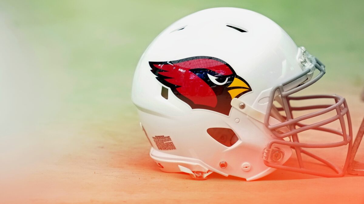
Considering how adorable and harmless Cardinal birds are, you gotta give the team credit for putting together a somewhat-fierce looking bird here.
I mean, it’s at least scarier-looking than the St. Louis Cardinals’ logo.
12. Tampa Bay Buccaneers
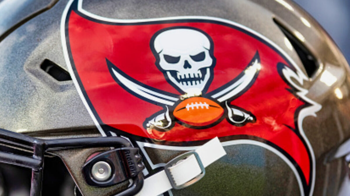
Derrick Brooks, Warren Sapp and Simeon Rice turned the Bucs into a winner and struck a lot of fear into the hearts of opponents with their scrappy and ultra-physical styles of play. Those three alone helped at more intimidation to the Bucs’ slick pirate logo.
Less than two decades later, Tom Brady arrived in Tampa and led a high-powered offense that couldn’t be stopped at full strength. That too was pure intimidation for all the other teams to deal with.
Anywho, in regards to the logo itself? Pretty intimidating with the smiling skull and two swords. Not something to mess around with!
11. Minnesota Vikings
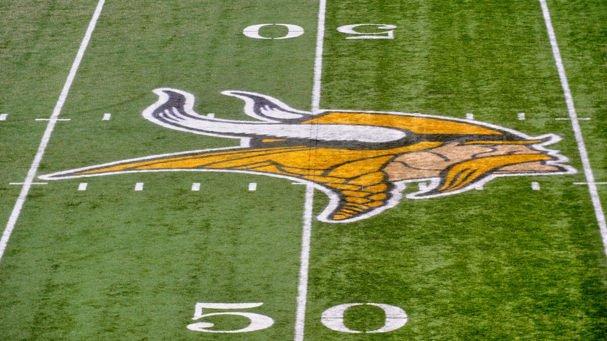
We love everything about the Vikings uniforms, logo and team name. Of course you want something that looks fearsome when you’re named Vikings, and the football team perfectly presents the logo that way.
No wonder the logo has seen very few changes over the past six decades. Why fix something that ain’t broke? The Viking horns on the helmet add the extra-bonus intimidating points.
10. Las Vegas Raiders
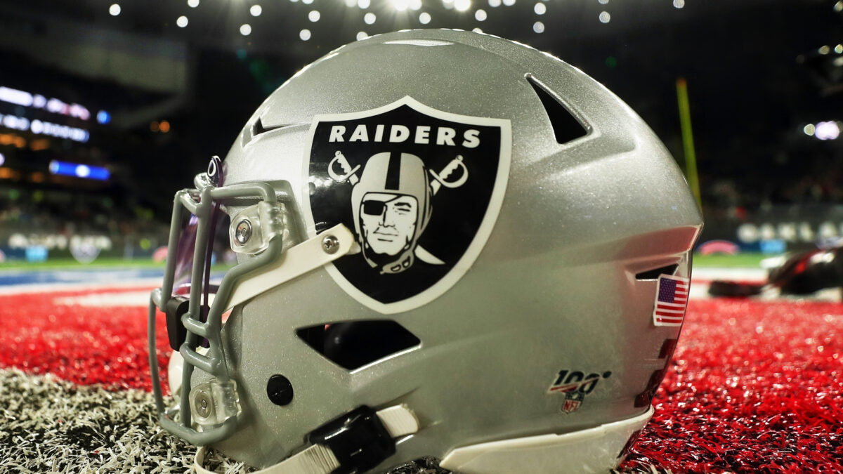
With all due respect to the Bucs, the Raiders barely get the nod here with their pirate-themed logo. There’s just something cool about the helmet and eye patch that make this logo stand out more — and the two swords are a beautiful finishing touch.
Notice that the logo is also in the shape of a shield? It just all works beautifully.
9. Atlanta Falcons
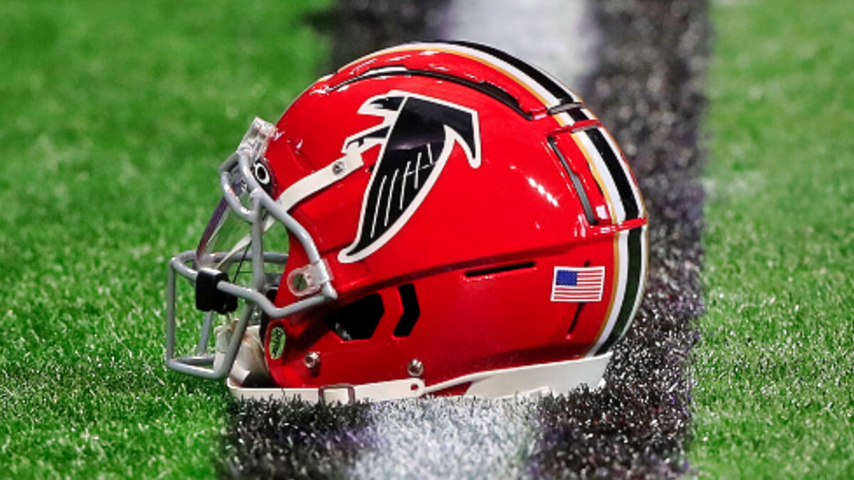
As far as birds go, few are more vicious and aggressive towards humans than the falcon. So Atlanta’s NFL team made the right call with their team name — and the logo was done beautifully as well.
Also, notice the slick “hidden meaning” in Atlanta’s logo? The Falcon bird is shaped like the letter “F”. Why couldn’t the teams who ranked near the bottom of our list do a fancy-shaped letter like Atlanta here?
8. Carolina Panthers
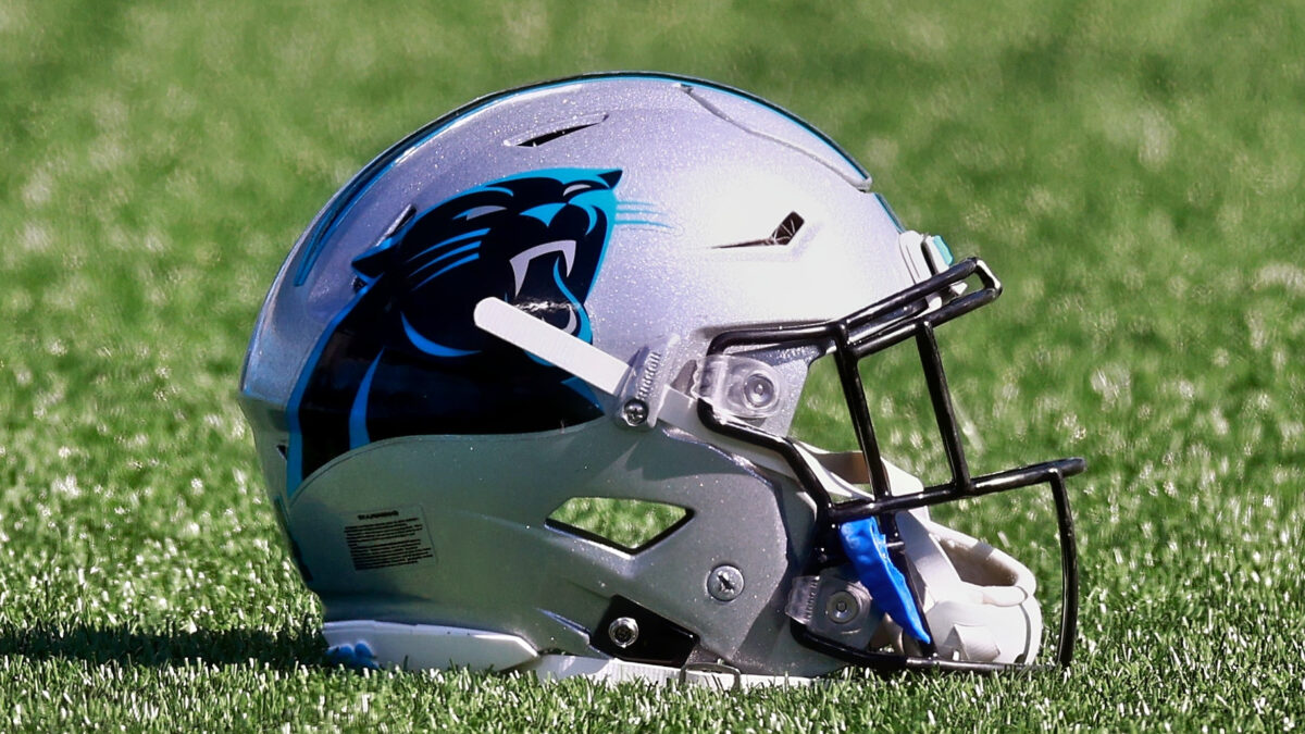
Now we’re starting to get into the meaty part of this list with all the intimidating animals whose logos were done right.
The Panthers also haven’t changed their logos much since their inaugural 1995 season — and for good reason. Ever see a photo of a black panther with its mouth open? Google it, and you’ll see how well the designers did in making the logo resemble it.
7. Seattle Seahawks
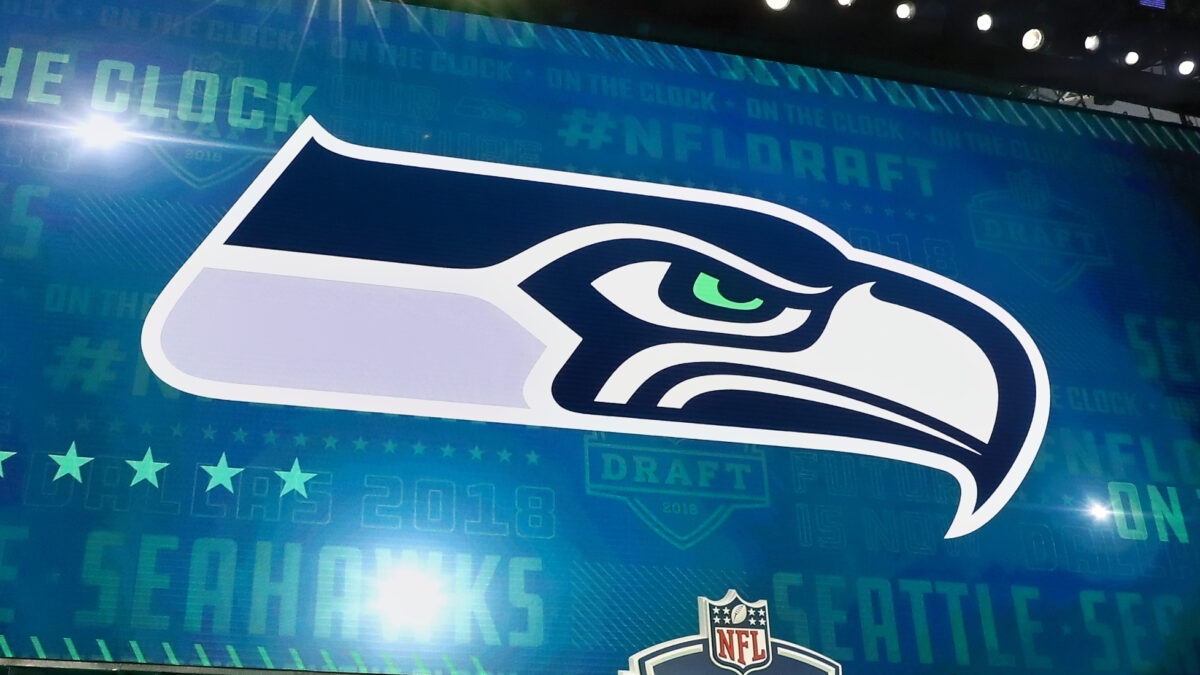
Staying on the topic of bird-themed names, the Seahawks also did a dandy of a job in designing their logo here. We love the alliteration and play off “Seattle”, and their jerseys are right up there with the NFL’s best.
Everything about Seattle’s logo and uniform works – including the ultra-firm look on the face of the Seahawk here.
6. Detroit Lions
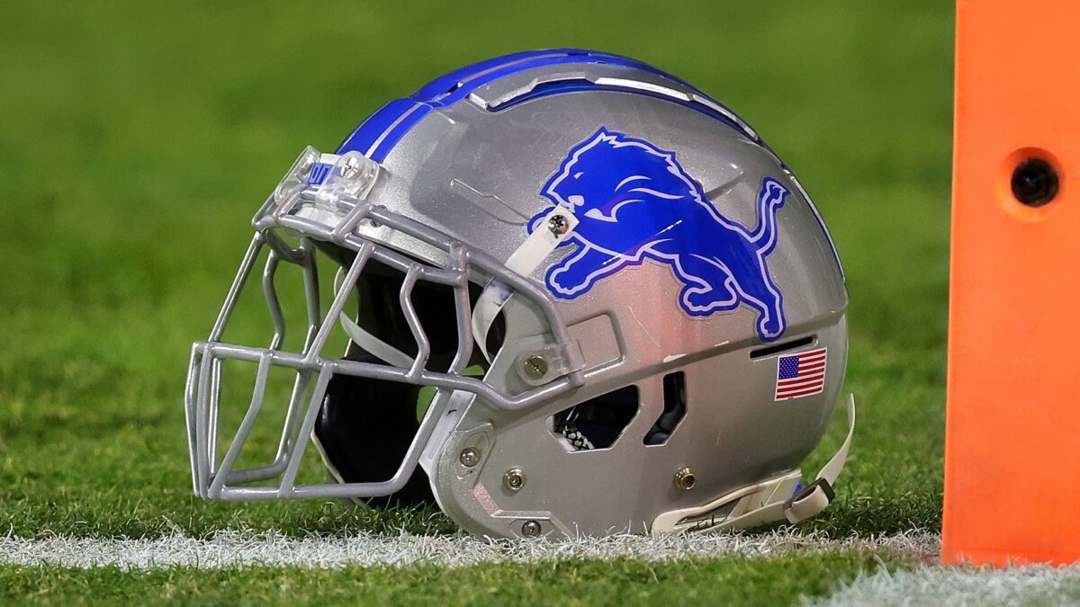
Not a whole lot has to be said on this one. When you think of which animals you would LEAST like to come face-to-face with, the lion immediately jumps out.
Some might find the blue-colored Lions logo a bit cheesy, but it works for us. It’s been around a long time, and Detroit football is synonymous with blue and silver — so no sense changing it now.
5. Buffalo Bills
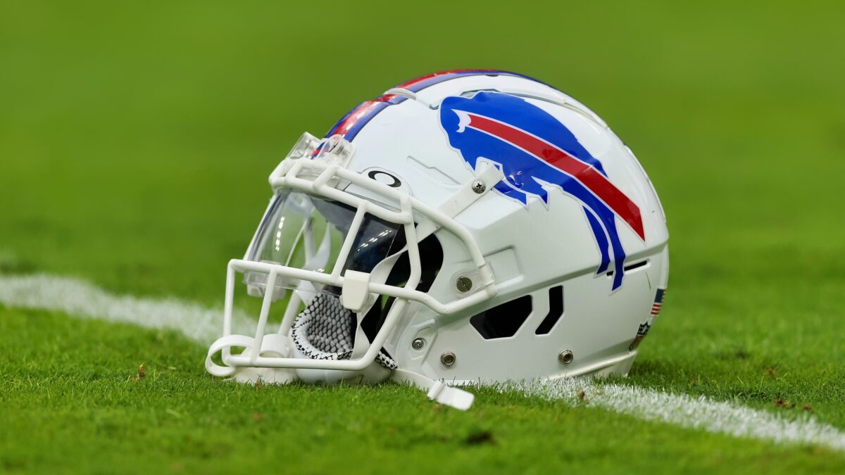
Speaking of creatures you definitely don’t want to confront in person — at least in the open wild…
The Bills, of course, are named after legendary American bison hunter and soldier, “Buffalo Bill” Cody. But being based in Buffalo and all, the Bills organization creatively decided to form their logo around an actual Buffalo.
And now that the Bills are actually good at football, doesn’t it scare opponents a bit more when they see that logo on their schedule…and on the field?
4. Baltimore Ravens
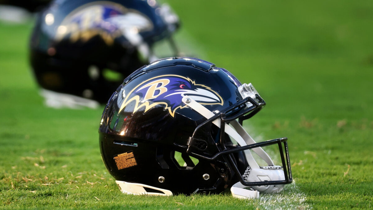
The Baltimore Ravens named their team as such because of the great poet, Edgar Allan Poe. You probably studied his most well-known poem, The Raven,, in high school — and Poe is buried in Baltimore.
Ravens are known for being territorial and aggressive when humans or other creatures come close — so it’s the perfect name for a football team…since the Ravens ‘defense is “trying” to protect their end of the field.
The logo designers did a wonderful job here in making the Raven itself look fierce, menacing and threatening.
3. Jacksonville Jaguars
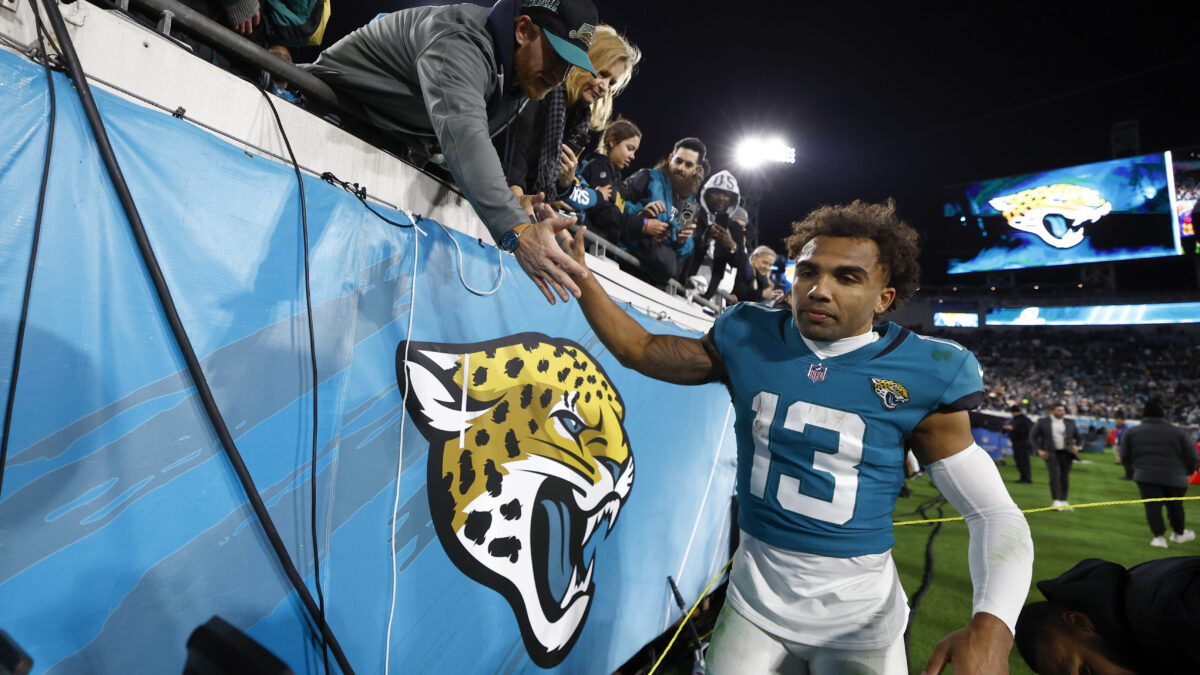
The Jaguars’ logo has undergone several changes since their inception in 1995. But there have been two consistencies with it: Awesomeness and pure intimidation.
Nobody wants to deal with a giant cat out in the wilderness. Look at the razor-sharp teeth in that Jacksonville logo. That’s intimidation 101, ladies and gentlemen.
2. Denver Broncos
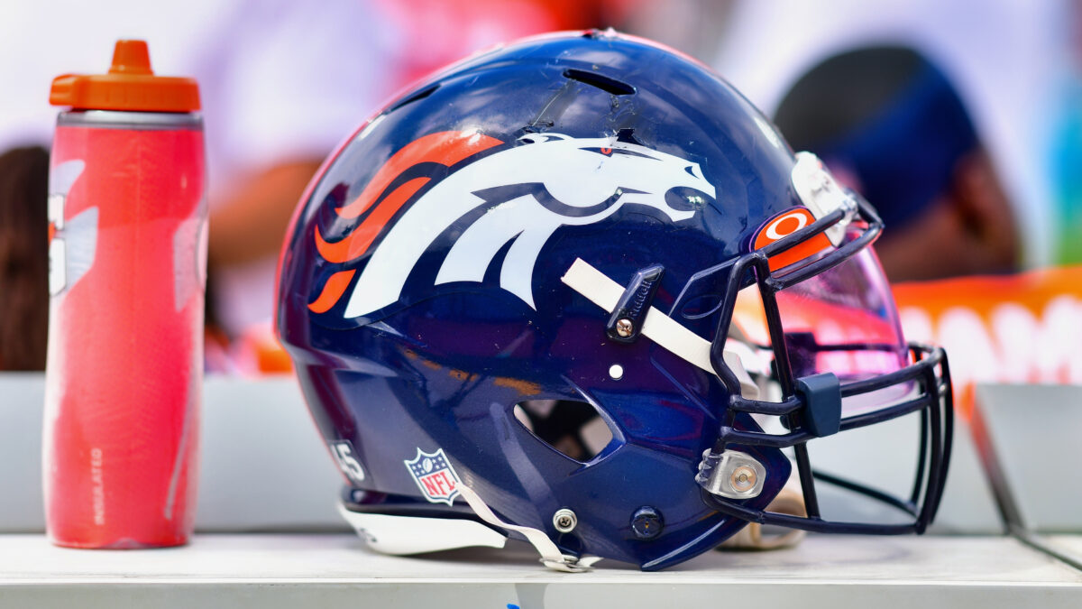
The Broncos’ old logo with the horse inside the letter “D” was pretty cool and all, but the one they’ve used since 1997 is even greater.
Horses are beautiful, friendly and adventurous creatures. But the Broncos’ logo displays the look of a determined, angry and aggressive horse. And that’s how it should be when you’re trying to win in the physically-punishing and unforgiving game of football.
Plus, y’know, the Broncos have won three Super Bowls since changing logos. Including back-to-back in their first two years with the current logo. Just sayin’.
1. Philadelphia Eagles
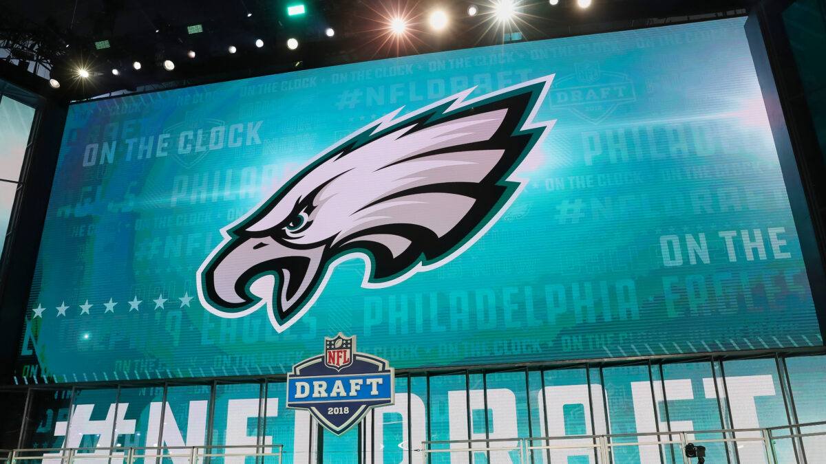
Congrats to the Eagles. You are proud owners of the NFL’s most intimidating-looking logo.
No, the Eagle isn’t the most aggressive nor intimidating creature among NFL team names. But the intimidation factor is just grade-A stuff.
The bird has its eyes on the prize, and when you consider the intimidating atmosphere of Philly sports fans at Lincoln Financial Field, it all goes hand-in-hand. If you knew nothing about football and were shown a card of all 32 team logos, this one should take the cake as the most likely to haunt your dreams.
It’s picture-perfect.


