The Miami Dolphins are headed into a very important season in 2023 after they shocked just about everybody with their play last season.
Aside from their play, the team is going viral this week over a logo design. Not exactly an official one, but one that was created by a fan.
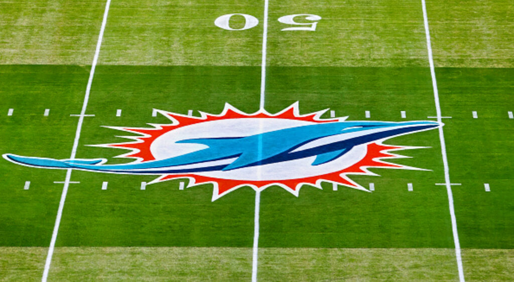
The Miami Dolphins redid the beloved logo on their helmets almost ten years ago, making the dolphin look more “realistic” and taking away its helmet with the orange “M.” It was a break from the one introduced when the team debuted in 1966.
A new logo will always divide opinions. Some fans will like it, others will tolerate it, and, in all likelihood, this will make up the vast majority of fans.
Here is the newest logo redesign.
Here are the various reactions to it:
Click on ‘Follow Us’ and get notified of the most viral NFL stories via Google! Follow Us
Miami fans have been represented by a Dolphin wearing a football helmet for their entire lives. This new design puts a new twist on the Dolphin and really makes it jump out at you.
Outrage might be popular in today’s society, but it’s worth remembering that tradition isn’t dictated by logos or uniforms, but rather by divisional titles and Super Bowl wins. Since Dan Marino’s retirement, they have experienced mediocre levels of success and have just five playoff appearances.
The newest team has hope to not only make the playoffs year but get further into the plays as long as the quarterback can stay healthy.


