Logos are an integral part of American sports. It is a great aspect of the whole fan experience. Defending your teams—or criticizing rival organizations.
There is, however, more than meets the eye—even with some of the most popular logos. Let’s take a look at 30 teams with logos that have hidden images or meanings in them.
30. Los Angeles Clippers (NBA)
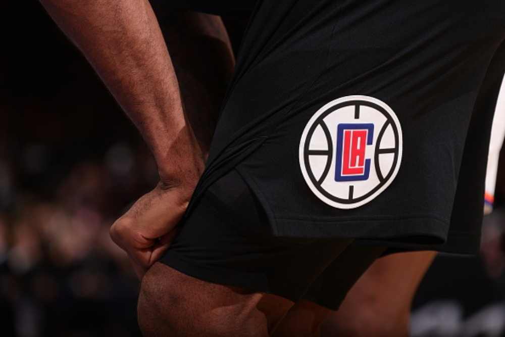
While most people may not think of the military when they think of Los Angeles or the Clippers for that matter, they are deeply related and there is a quiet nod to that reality in their logo. The letter “C” is actually a compass with a naval ship inside as a tribute to “clipper ships” that gave the team its nickname when it played in San Diego from 1978 to 1984.
29. New Jersey Devils (NHL)
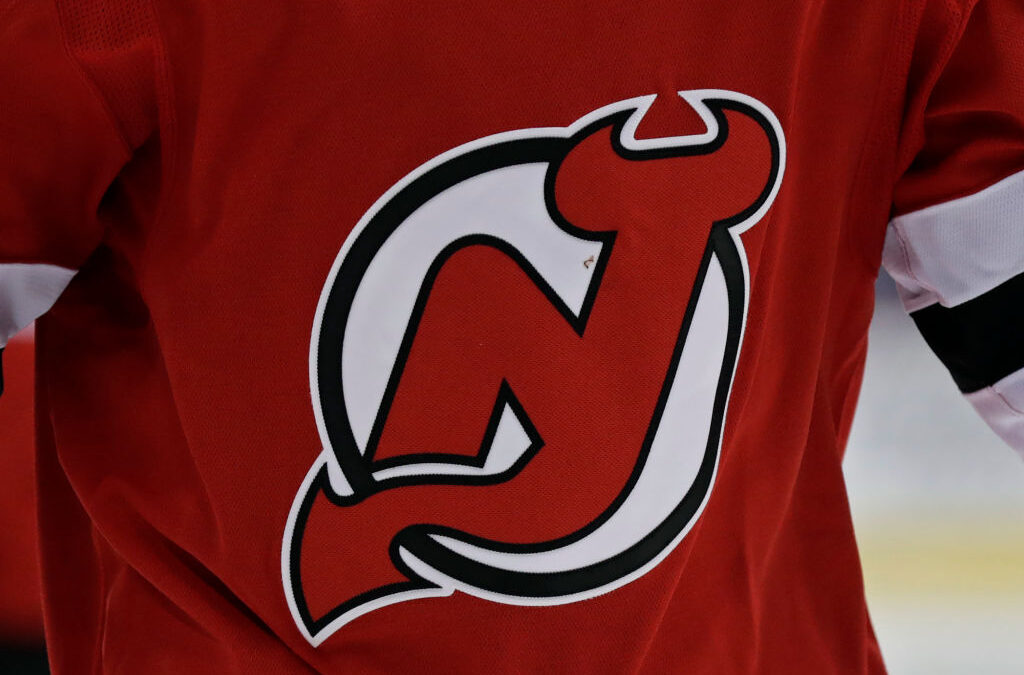
The New Jersey Devils have one of the most popular logos in the NHL and a subtle message intertwined in it to boot. The “N” and “J” come together to form devil horns at the top and a tail as a hat tip to the franchise’s nickname.
28. Seattle Mariners (MLB)
Click on ‘Follow Us’ and get notified of the most viral NFL stories via Google! Follow Us
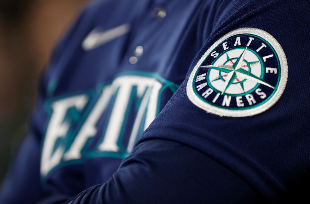
There is no mystery around what the Seattle Mariners logo is, but what’s neat is that the compass logo is oriented towards the Northwest, as a nod to the Pacific Northwest region that the team calls home.
27. Kansas City Chiefs (NFL)
The Kansas City Chiefs are one of the most history-rich franchises in the NFL and their logo is iconic. While some people may have drawn the connection between the arrowhead shape, which is representative of the team’s stadium name, there is a fun little-known secret about the logo—team founder Lamar Hunt actually drew it himself on the back of a napkin while he was flying cross country way back when.
26. Indiana Pacers (NBA)
The Indiana Pacers logo features a nice contrast between the gold and blue colorways and the “P” incorporates a basketball that is in motion, which people have linked back to Indiana’s love for the sport and a traditional, ball-movement-heavy style of offense.
25. Buffalo Sabres (NHL)
If you were ever thinking that Sabre is an extremely random name for a sports team, well, there’s a reason. Buffalo’s NHL team actually got its name from a fan contest and a man chose the name because he believed the weapons were used effectively for offense and defense. There is an added layer of depth for this one too, as the swords form a “B” for Buffalo.
24. Memphis Grizzlies (NBA)
Layered into the logo of the Memphis “Grizzly” is an impressive outline of the Memphis Bridge. It is nice to mix in some tribute to the city, as they really had no business maintaining that team name when the franchise was relocated there.
23. Chicago Bulls (NBA)
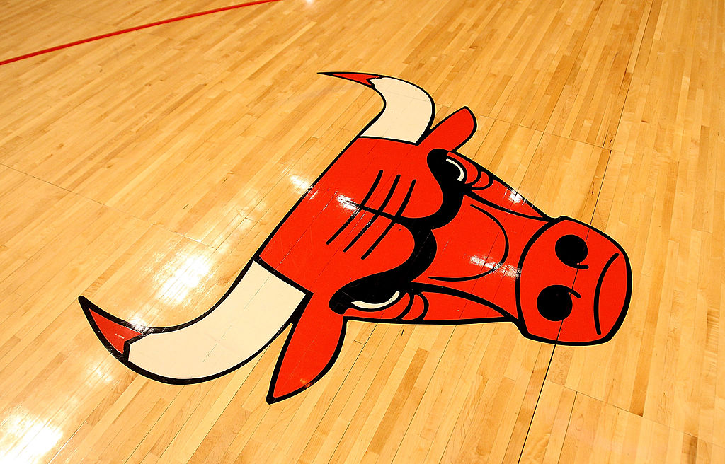
This was discovered recently, but if you flip the Bulls’ logo upside down, it eerily resembles a robot who’s riding a crustacean. We all know this was unintentional and does not affiliate with the Bulls, but it’s still a bit funny when you look at it.
22. Atlanta Falcons (NFL)
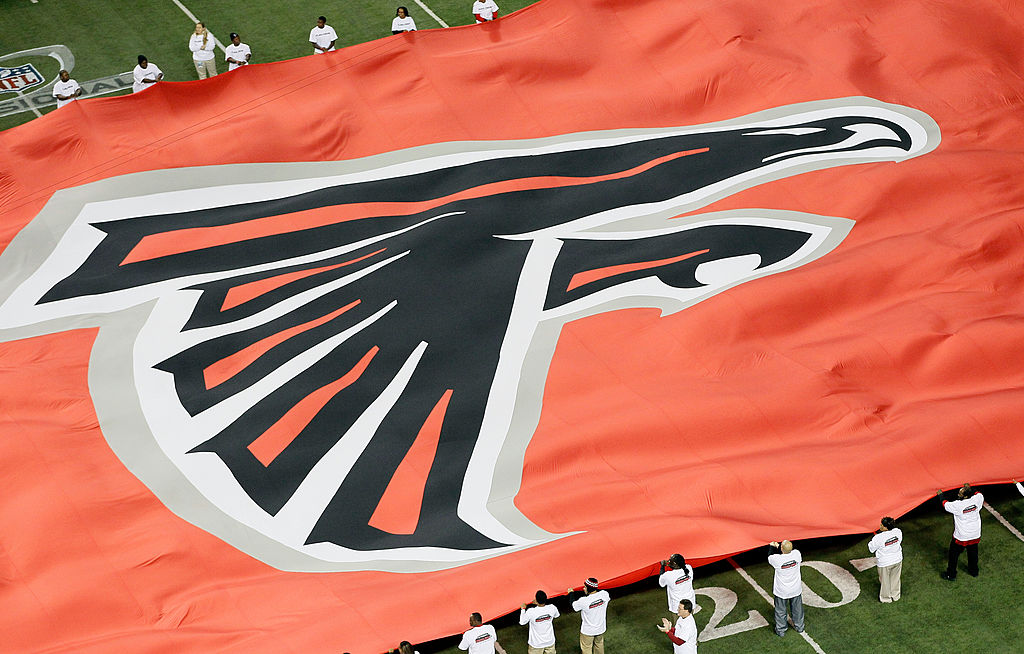
Atlanta’s black and red falcon logo is one of the slicker-looking designs in the NFL. The logo also just so happens to form the shape of an “F” for Falcons.
21. Milwaukee Brewers (MLB)
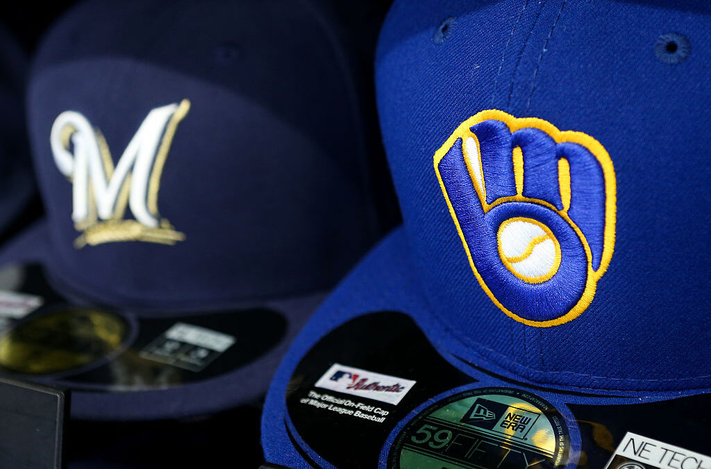
Not too dissimilar from what the Falcons did, the Milwaukee Brewers managed to feature the key letters of their namesake as well, with the glove forming an “M” and a “B.”
20. Washington Capitals (NHL)
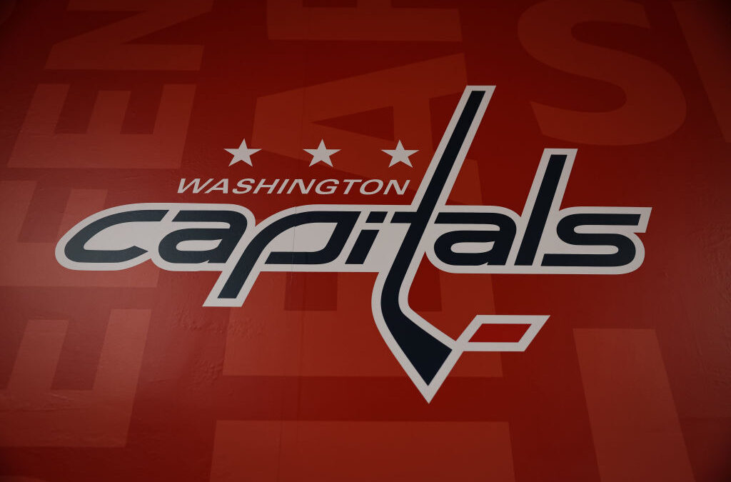
The Washington Capitals have one of the more intricate logos in the NHL. The eagle logo contains a silhouette of the Capitol building and the three stars that are featured represent the three main geographic areas in the Capitals’ market: Virginia, Washington D.C. and Maryland.
19. Minnesota Twins (MLB)
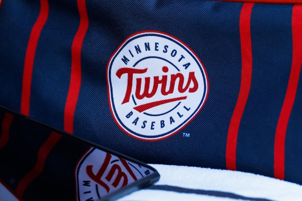
Minnesota is sort of hiding in plain sight with this one, but the “win” is underlined in Twins to underscore their interest in winning.
18. Columbus Blue Jackets (NHL)
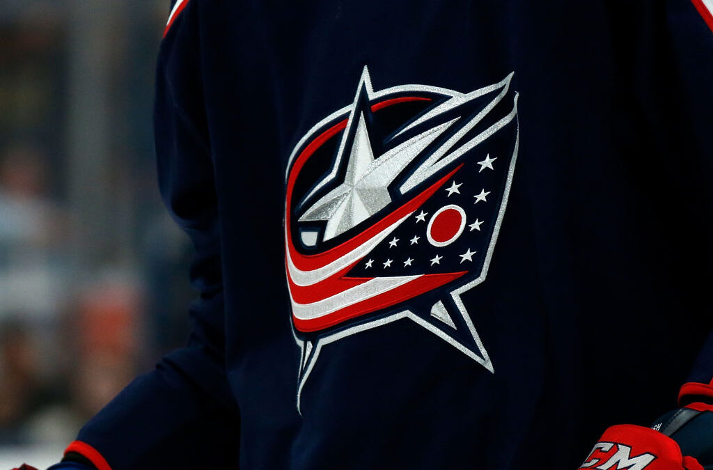
The Columbus Blue Jackets name pays homage to the people in the area who served in the Union Army during the Civil War and its logo echoes that with a hidden star and flag motif that represents patriotism.
17. Toronto Blue Jays (MLB)
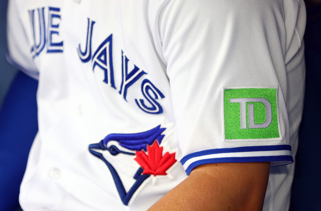
The Toronto Blue Jays have a nice, tight logo with a bright red maple leaf pinned to the side of the bird’s head that subtly represents Canada.
16. Baltimore Orioles (MLB)
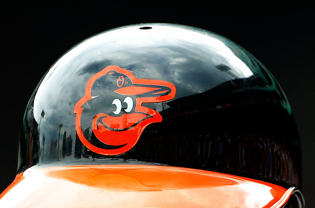
The cartoon bird that the Baltimore Orioles feature as their logo doesn’t have a secret meaning per se, but rather a mystery. Is the bird’s mouth open or closed? The internet seems to be split on it and the world may never truly know.
15. Carolina Hurricanes (NHL)
The Carolina Hurricanes have an aestheticized red, black, and white swirl that vaguely resembles a hurricane and features a black dot in the middle that people say is meant to be the eye of a storm.
14. Arizona Diamondbacks (MLB)
The Diamondbacks logo has changed color schemes a couple of times over the years, but one secret truth has remained the same, the “A” is stylized to symbolize the teeth of a snake.
13. Cincinnati Bengals (NFL)
This one may be a little bit more commonly known, but I’m willing to be that there are more than a couple of NFL fans out there who didn’t realize the “B” logo on the Bengals uniforms is patterned like tiger stripes.
12. Minnesota Wild (NHL)
There is a bright white star featured in the middle of the forest landscape that is the Wild’s new logo. This is a secret tribute to the state’s former NHL franchise, the Minnesota North Stars.
11. Detroit Lions (NFL)
Detroit’s Lion logo is one of the most iconic in the game—and if you were ever wondering why, it is that bright shade of blue instead of something more traditional for a lion, it is because the team’s first owner G.A. Richards took a trip to Hawaii and became enchanted with the color of the Pacific Ocean. Hence the Honolulu blue-colored lion that we all just seem to accept.
10. Utah Jazz (NBA)
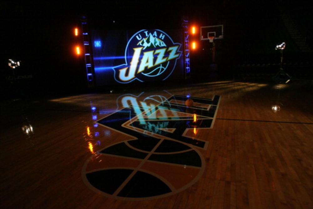
The Utah Jazz have had quite a few different looks over the years, but their most recent logo is an interesting one. The note that symbolizes jazz music also forms a “J” to tie back into the spelling of the team name.
9. Dallas Cowboys (NFL)
People may be confused why the Cowboys logo is a big old star rather than a, you know, cowboy… But the star is a tribute to the state of Texas, which is commonly known as the “Lone Star State.”
8. Houston Rockets (NBA)
The Houston Rockets’ big red “R” logo looks straightforward, but it interestingly forms a rocket launch trail with the way the bottom of the letters drips out.
7. Tampa Bay Rays (MLB)
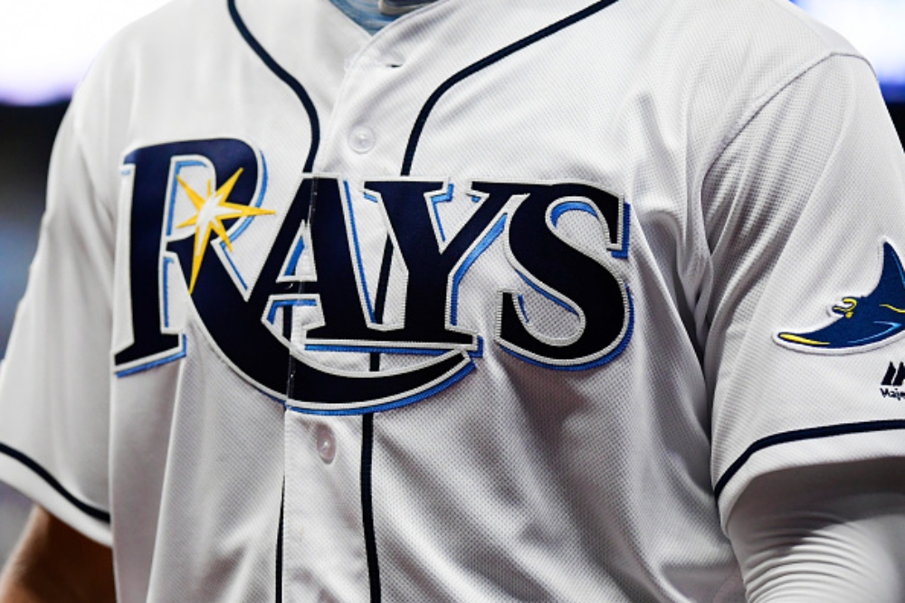
The Tampa Bay Rays logo is layered with meanings. The Long R stands for the waves in Florida and the twinkling yellow star signifies the sunshine that Florida is oh, so well known for.
6. Colorado Avalanche (NHL)
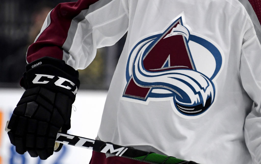
While most people recognize that the Avalanche’s “A” is stylized with snow to represent a—you guessed it—an avalanche, it also wraps into a loose “C” shape to represent Colorado.
5. Vancouver Canucks (NHL)
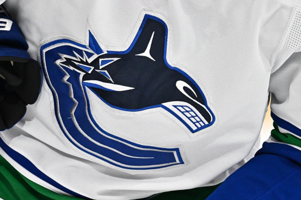
Vancouver’s “C” logo surprises a lot of people because there is an orca whale that seems to be emerging out of it. While some think that it is a nod to the Pacific Northwest, it is a reference to the team’s ownership group, Orca Bay Sports & Entertainment.
4. Pittsburgh Pirates (MLB)
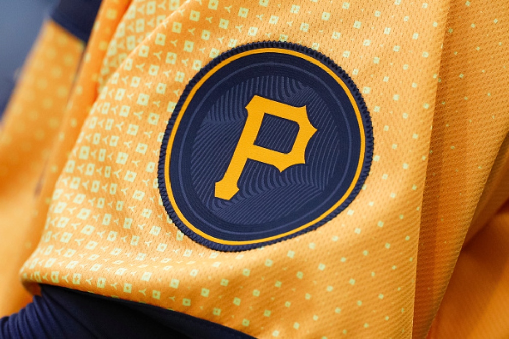
The “P” in the Pittsburgh Pirates logo manages to incorporate a baseball and two bats in a nice tribute to the first letter of the team and city.
3. Montreal Canadiens (NHL)
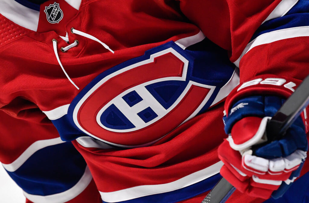
The Montreal Canadiens have one of the more peculiar-looking logos with the big red “C” which intuitively stands for Canadiens, but the “H” in the logo has always been more of a mystery. Rather than anything to do with the city or team name, it merely represents hockey.
2. Orlando Magic (NBA)
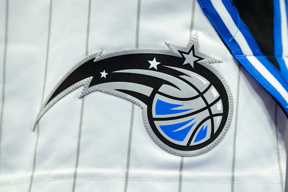
The stars in the Orlando Magic’s logo pay tribute to their prior logos that had a star slotted in for the “a” in Magic. The team’s name itself also draws a connection to the area’s ties to the Walt Disney Company and its parks.
1. Philadelphia Eagles (NFL)
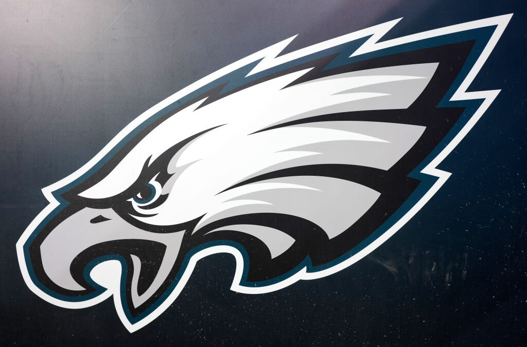
The Eagles have one of the most popular NFL logos and it has an interesting secret quirk. The Eagle head flanked off the sides of their helmets forms an “E.”


