
While many sports teams can’t help but change their jerseys and logos every-so-often, some organizations have played it smart by sticking with the same look over the long haul — albeit with some very minor changes over the years.
Change is good sometimes, but we have also seen it totally backfire over the years. With that being said, there are several fan bases out there who are just dying to see thier team undergo a massive uniform makeover.
Here are 10 professional sports teams who need to change their jerseys ASAP — whether that means bringing back their old ones or introducing something brand new altogether.
New England Patriots

Whether you loved them or hated them during the Tom Brady-Bill Belichick golden years, there’s no denying that the Patriots once had some of the slickest uniforms in sports.
When Brady left New England in 2020, the Patriots introduced brand new futuristic-looking uniforms. At the time, it kinda made sense since it was a completely different era of football without the GOAT.
But the Patriots have been mired in mediocrity since TB12’s departure. Perhaps that’s a sign it’s time to change jerseys again?
Click on ‘Follow Us’ and get notified of the most viral NFL stories via Google! Follow Us
Hey, look no further than the Tampa Bay Buccaneers in 2020. They signed Brady, brought back the jerseys from their late-90s/early 2000s glory days, then won Super Bowl 54 that same season. Go figure!
The Patriots’ jerseys from the Brady era were the best in franchise history. They’re synonymous with winning and historical dominance. We know they just switched uniforms in 2020, but it’s not too early — or should we say, too late — to go back to the Brady era unis.
Just get rid of these ugly, news ones… I mean, just because the team sucks now, doesn’t mean their uniforms have to as well.
Buffalo Sabres
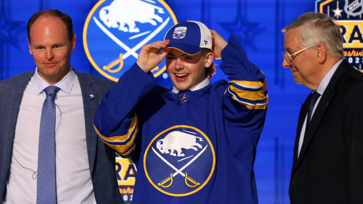
Man, are we longing for the return of the Sabres jerseys, colors and logos from 1997 to 2006. In that span, they reached three conference finals and the 1999 Stanley Cup Final — infamously losing to the Dallas Stars in controversial fashion.
Well, the Sabres are the active owners of two of the longest droughts in sports: The longest active playoff series drought, having last won a best-of-seven in 2007…and the longest active postseason drought. When did they last qualify? Way-back-when in 2011.
The Sabres have been hockey’s ultimate laughing stock since 2012, constantly changing GMs, coaches and jerseys. It’s getting to the point where it hard for even the most diehard Sabres fans to keep up.
Those old red-and-black jerseys were among the best in hockey. Maybe the Sabres don’t want to bring back the exact same logo, but we’d ditch these out-of-date blue-and-yellow jerseys that have too much of a ‘70s look to them.
We actually dig most teams’ current NHL jerseys and logos…but the Sabres’ current ones are just straight up terrible. They’ve been long associated with losing and humiliation. Either bring back the late 90s-early 2000s uniforms, or offer something new altogether.
It’s time to usher in a new era of Sabres hockey. And it starts with new jerseys.
Phoenix Suns
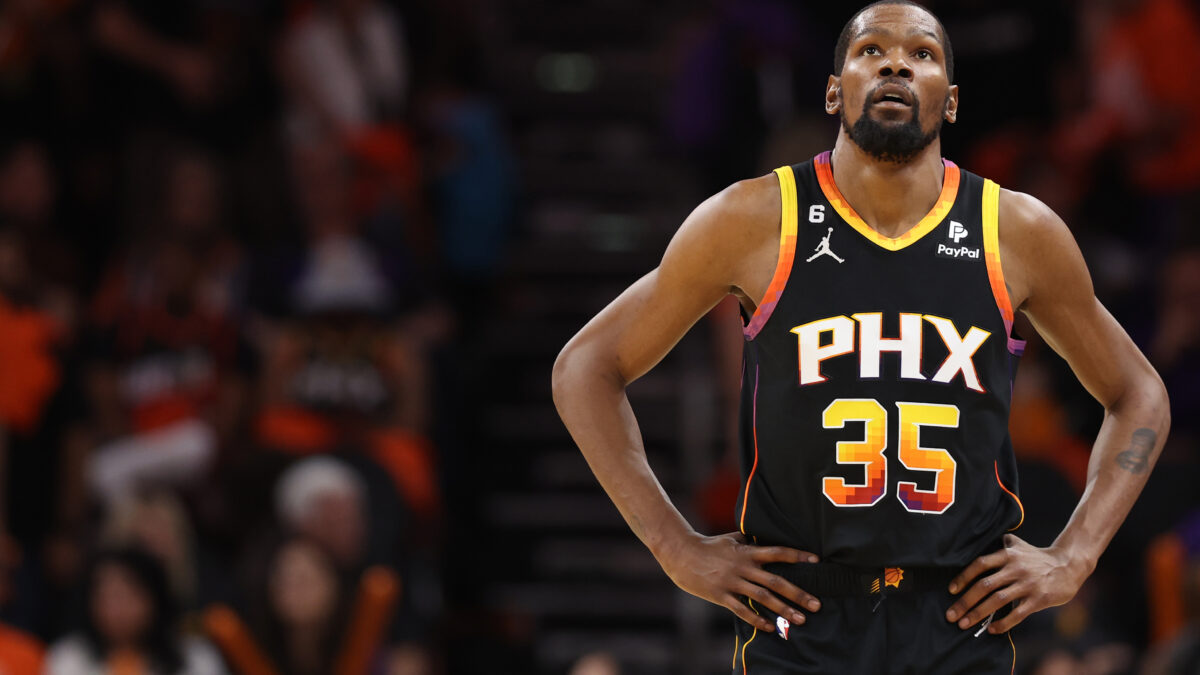
The Suns’ current uniforms are just way to ‘90s vintage looking. There will always be a large number of folks who find the bright color schemes appealing, but their current look just doesn’t work.
Do they really need purple as the dominant color? The Sacramento Kings already have that color, and it’s one of the Los Angeles Lakers’ main colors along with yellow. It’s not like the Suns are the ones who made it cool.
Phoenix had awesome jerseys in the Steve Nash-Shawn Marion-Amar’e Stoudemire days. The dominant-purple colored jerseys and the main black unis with a million colors along the edges and inside the numbers are just too much. Are they trying to dress up for a ‘90s theme party?
A team with the name “Suns” should have red, yellow or orange as its main jersey colors. In Phoenix’s case, they should be going back to orange as the main color.
Either way, these current uniforms just aren’t cutting it.
Cleveland Guardians

We fully dig the Guardians’ team name and logo change that went into effect in 2022. But did they realllllllly have to keep the same jersey colors and designs intact?
They couldn’t change it up? Not even a little bit?
Notice when the Florida Marlins rebranded themselves as the Miami Marlins, they went with completely different colors, logos, uniforms and designs?
The Guardians, like every other MLB team, have their home whites, road grays and alternate navy and red jerseys. The new team name just felt like a good time to introduce a whole-new look altogether — although, nobody said the popular red and blue alternates had to go away entirely.
It’s primarily the away gray uniforms we don’t like for the Guardians. It’d be nice if they incorporated a little more red and blue in their jersey colors, as opposed to just having the word “Cleveland” in the dark blue and red colors, and nothing else.
Utah Jazz
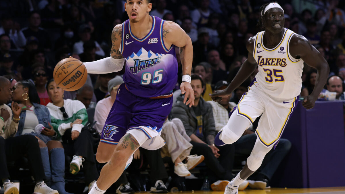
We get it. It’s difficult to find the right jersey designs and colors when your team name is the “Jazz”. But hey, nobody said the Utah Jazz had to keep the team name intact when they relocated from New Orleans.
The purple-colored “mountain” jerseys made famous by Karl Malone and John Stockton were by far the best in franchise history.
The Jazz bring these back every-so-often, but we simply can’t get enough of them. We’re not just calling for Utah to drop their entire slate of home, away and alternate uniforms. We’re telling them to make the purple mountain jerseys permanent again.
Please….and THANK YOU!
Vancouver Canucks
We are of the belief that if you suck for a lengthy period of time, it’s probably a good idea to re-brand yourselves and change up your uniforms and logo. Regarding some fairly recent examples, it definitely worked for the Los Angeles Rams, Golden State Warriors, Florida Panthers and Seattle Seahawks…to name a few.
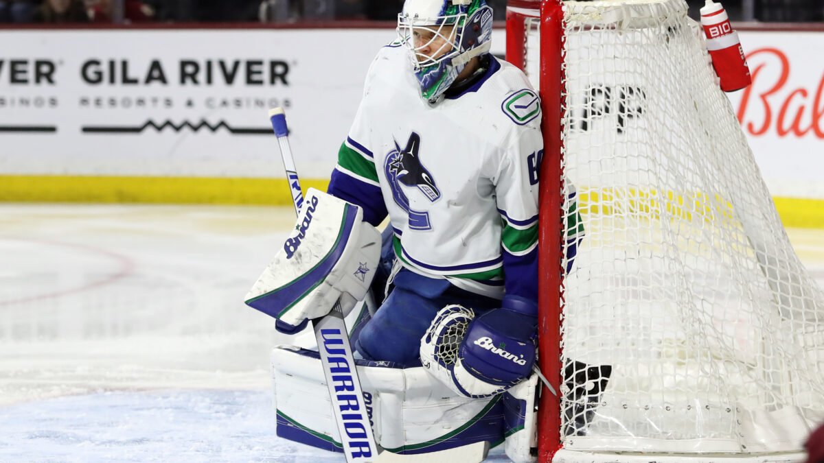
This is something the NHL’s Vancouver Canucks desperately need. They were an annual Stanley Cup contender from 2001 to 2013 but have made the postseason only once since 2016 — and that was thanks to the expanded playoff format during the COVID bubble.
Take away the weird COVID-affected 2019-2020 season, and the Canucks have made the postseason once and haven’t won a playoff series since 2011. In other words, not great Bob.
The Canucks have used the main blue, green and white jersey color scheme since 2007-08. Yet long before that, the organization wasn’t afraid to drastically alter their uniforms every so often.
It’s long overdue to drop these current jerseys that have really just become a symbol of irrelevance, dysfunction and mismanagement. The Canucks should bring back the popular and iconic “Flying Skate” jersey that was super popular in the early and mid-90s.
The Canucks wear the flying skate jerseys as an alternate on occasion, and it’s always a hit for the fans. This logo was worn during the franchise’s storied run to the 1994 Stanley Cup Final. Franchise greats like Trevor Linden, Pavel Bure and Kirk McLean made this uniform special.
Why not start out the next kick at a hopeful franchise renaissance by bringing back the Flying Skate logo, along with the black, red and yellow color scheme? Even if the Canucks continue to embarrass themselves on the ice, at least they’ll look good while doing it in those slick uniforms.
Indiana Pacers
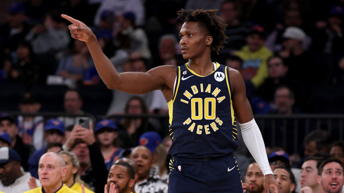
The Pacers might feel like a random choice, given they’re a small market team that truly hasn’t been relevant since they traded Paul George to the Oklahoma City Thunder more than a half-decade ago…
But they’re mostly on this list because we’re dying for a return of the Reggie Miller slash Ron Artest era uniforms. From 1997-98 to 2004-05, the Pacers had those beautiful pinstripe uniforms and a nice dark-blue color with white stripes and eye-catching yellow colors.
But these current Pacers uniforms? Yeah, they don’t do it for us. It’s like the aforementioned Phoenix Suns and Utah Jazz. Though we don’t quite hate the main-navy ones, they’re trying too hard with the dominant yellow jersey colors.
Even if the Pacers want to keep their color scheme in place, can they at least bring back the pinstripes? It’d be a nice way to pay homage to Miller and Artest, who were members of the greatest era in this franchise’s otherwise sad history.
Otherwise, anything new will do. Please! Anything but whatever they’re wearing right now.
Arizona Diamondbacks

We’re sure we aren’t the only ones who are longing for the return of the Diamondbacks’ striped jerseys they wore in their early years of existence…the ones that were especially made famous when they won the 2001 World Series.
The Diamondbacks’ current set of jerseys are downright ugly. It almost feels like the designers of the present uniforms just wanted to throw a bunch of different color schemes at the wall with the hope they would stick. Apparently, they did stick, since ownership gave these unis the thumbs up in the first place.
We’re not here to say the Diamondbacks need to bring back the late 90s and early 2000s uniforms. But the old home unis were slick with those New York Yankees pinstriped-like uniforms. And quite frankly, we’d love it if more Major League Baseball teams used those pinstriped patterns. Don’t be afraid of copying the Yankees. We won’t say anything. We promise.
Arizona’s “Sedona Red” colors are just kinda bland, and they don’t have much creativity in terms of overall design. Anything similar to the franchise’s first slate of uniforms would do nicely. Hey, remember, the old black jerseys with the white-pinstriped pants? That design was pretty awesome.
Way better than what they’re wearing now. So dear Diamondbacks: Please change already.
Anaheim Ducks

It’s really something when you can go from one of the best team names and logos in all of sports to one of the absolute worst.
From 1993-94 to 2005-06, they were “the Mighty Ducks of Anaheim”, named after the popular 90s Disney trilogy.
Yes, those very Mighty Ducks that Gordon Bombay coached were the inspiration behind the name for an NHL team — hence why you saw the old Mighty Ducks’ NHL jerseys in the second and third installments of the trilogy.
But then in 2006-07, Anaheim dropped the “Mighty” part of their name and went with, simply, “Ducks.” Sorry, but whose idea was it to go from “Mighty Ducks” to just “Ducks”?
They also went from the slick and universally loved Mighty Ducks goalie mask logo to a stupid logo that simply reads “Anaheim Ducks.” The logo has since been changed to a goofy-looking “D” that’s just plain boring and lacking in creativity.
Maybe they’ll never bring back the original “Mighty Ducks” name and logo. We get that. But please change up that awful color scheme already. The black, orange and gold are just an ugly mix, and did we mention how ugly and awful the “D” logo is?
Even if the old Mighty Ducks logo isn’t returning, the old purple and turquoise designs oughta make a permanent comeback. Those were way more creative in terms of color. And let’s face it: kids from the ‘80s and ‘90s will neverrrrrrrrrrr get tired of that look.
New York Jets
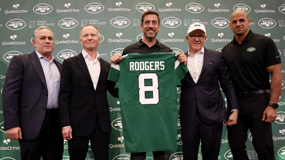
The previous “kelly green” and dark “hunter green” uniforms had nice kicks to them. But in 2019, the Jets introduced brand new outfits called the “Take Flight” uniforms.
The Jets introduced a shinier and more futuristic-looking green color and changed up the wording on their logo. Instead of reading “NY Jets”, it now reads “New York.”
Look, we don’t have a problem with the logo — and it’s hard to get creative when your team name is “Jets.” But we had no issues with the Jets’ old kelly green and its predecessor in the dark hunter green jerseys. These new ones are just hideous from head to toe — or from helmet down to the socks, we should say.
The Jets made a trade for Green Bay Packers legend and four-time league MVP Aaron Rodgers. What perfect timing it would’ve been for the Jets to usher in the new era by introducing a uniform change.
But alas, the NFL legend is going to be stuck going from one of the best uniforms in all of sports to one of the absolute worst. To each their own, we suppose…


