When you think of the best professional sports team logos, the obvious ones come to mind: In Baseball? The New York Yankees, Boston Red Sox, Los Angeles Dodgers.
In basketball? The Boston Celtics, Los Angeles Lakers and Chicago Bulls. Football? Pittsburgh Steelers, Dallas Cowboys, Minnesota Vikings, and so on. Hockey? The Montreal Canadiens, Pittsburgh Penguins, Detroit Red Wings et al.
But for a variety of reasons, some of the absolute best-of-the-best pro sports teams logos just never seem to get the love or recognition they deserve. But if you ask us, these 10 underrated logos are at or near the very top in their respective leagues.
Denver Nuggets
The Nuggets have always been savvy with their logo designing. Make no mistake, we loved the old ones from the Carmelo Anthony era with the blue-colored mountains in the background of the words “Denver Nuggets.”
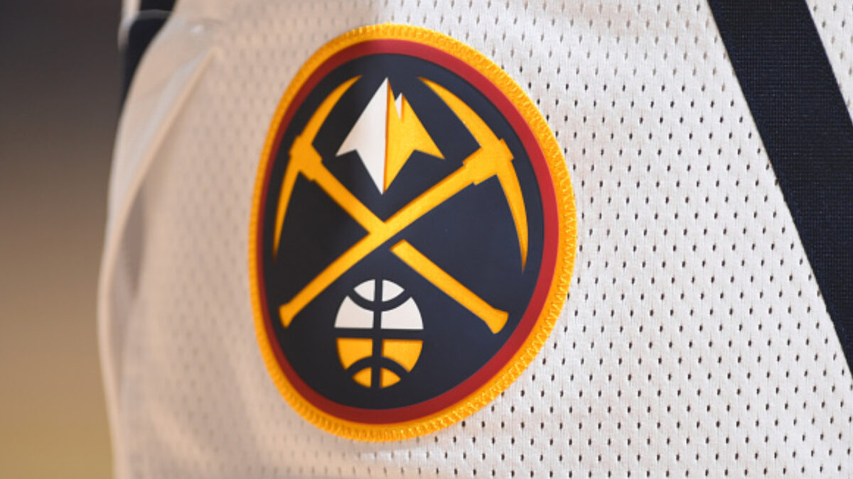
But the current ones that were introduced back in the 2018-19 season do the trick just as nicely, if not better. The current logo is a circle-within-a-circle-within-a-circle. The small circle has a pair of axes, a mountain peak and a basketball, with the medium-sized circle featuring the words” Denver Nuggets”, inside a bigger circle with a yellow-colored border.
The color schemes go hand-in-hand nicely, and the logo designers did a great job of combining past Nuggets logos and uniform colors into this one. The pickaxe and mountain peak are nice touches to a state renowned for its glamorous rocky mountains.
Click on ‘Follow Us’ and get notified of the most viral NFL stories via Google! Follow Us
Also gotta love how two of Colorado’s other sports teams, the MLB’s Colorado Rockies and NHL’s Avalanche, have team names that play off the whole “mountain” theme. But among these three, the Nuggets by far have the best logo.
Minnesota Wild
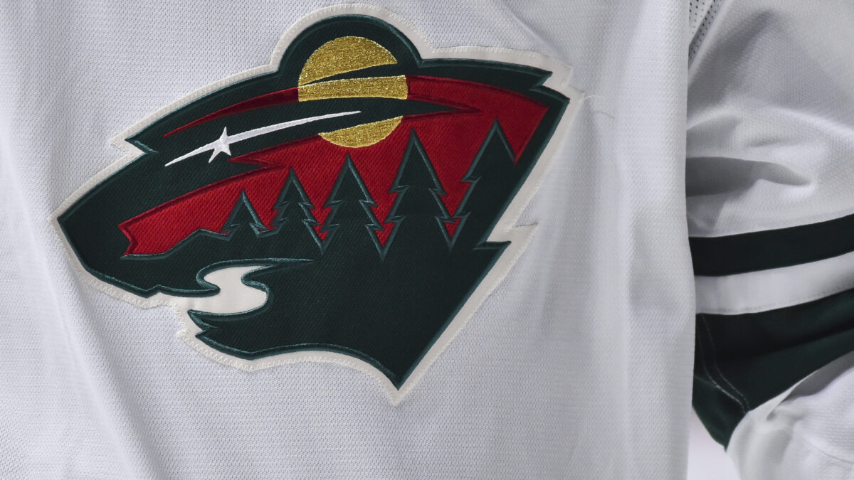
At first glance, the Minnesota Wild’s logo is a colorful scheme with a forest full of green trees, a red sunset and the North Star. But if you look extra closely, you’ll notice that the logo is actually formed in the shape of a bear.
The Wild are one of the younger NHL franchises, barely over two decades old. And they certainly don’t have much historic success to speak of, advancing past round two only once in their history.
So it’s hard for the logo of a mediocre and younger franchise to stand out. For the Wild, the logo simply doesn’t carry the same historic meaning as those of older franchises like the Montreal Canadiens, Boston Bruins, Detroit Red Wings, Toronto Maple Leafs or New York Rangers.
But if you ask us, this is easily a top-five logo among all NHL teams. The color combinations are just perfect, and the bear is a nice finishing touch on it. Plus, you want that intimidating-looking creature on your jersey when you play an ultra-physical sport like hockey.
We also love that Minnesota has retained green as its main jersey color, since few pro sports teams seem to use it these days. The Wild may not win a whole lot when it matters most, but they sure look good out there on the ice donning this logo.
New England Patriots
The Patriots’ “Flying Elvis” logo has taken its fair share of criticism since its inception in 1993.
Look, we get that old-timers grew up with the “Pat Patriot” logo. Yes, we know it was one of the slickest logos in football at the time. But that was life in the ‘60s, ‘70s and ‘80s. It was time for the cartoonish logos to drop by the time the ‘90s rolled around.
We don’t get the issue with the so-called Flying Elvis logo. It perfectly depicts the look of a menacing Patriot and beautifully ties in the nation’s proud colors of red, white and blue. And the silver-colored helmet gives it a beautiful final touch.
Of course, the two decades of constant winning under Tom Brady and Bill Belichick helped this logo grow into one of America’s more recognizable and iconic sporting logos. That’s life when you win nine AFC Championships and six Super Bowls, we suppose.
Now when you look at the Patriots logo, you’re automatically brought back to their glory days of the 2000s and 2010s. Just like when you look at the Chicago Bulls logo, it takes you back to the Michael Jordan era.
The Patriots logo is here to stay, and we wouldn’t have it any other way. It’s time to put it up near the very top with the other great NFL logos like those of the Pittsburgh Steelers, Minnesota Vikings and Dallas Cowboys.
Toronto Blue Jays
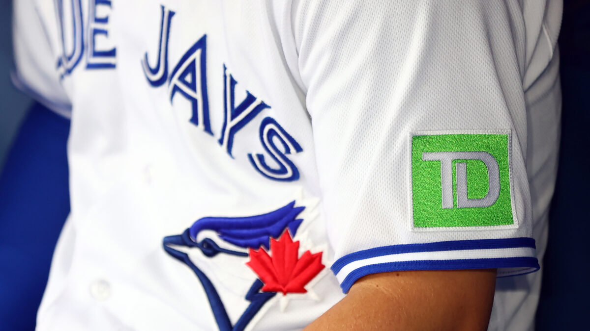
The Blue Jays have massive popularity across Canada, so their logo is obviously very well-recognized there.
But playing in the same division as two historic and highly-popular franchises in the New York Yankees and Boston Red Sox plus the annual powerhouse Tampa Bay Rays has made it difficult for the Jays.
The limited success since their back-to-back World Series pennants in 1992 and ‘93, coupled with the many logo and uniform jerseys, has made it hard for the Jays’ logo to really stand out in the baseball world.
The main logo the Jays have used since 2012 has a nice color scheme and design. The “Toronto Blue Jays” font and circle around the logo give it a nice old-school look. And being Canada’s only Major League Baseball team, how can you not like the red maple leaf as a tribute to Canada?
Jacksonville Jaguars
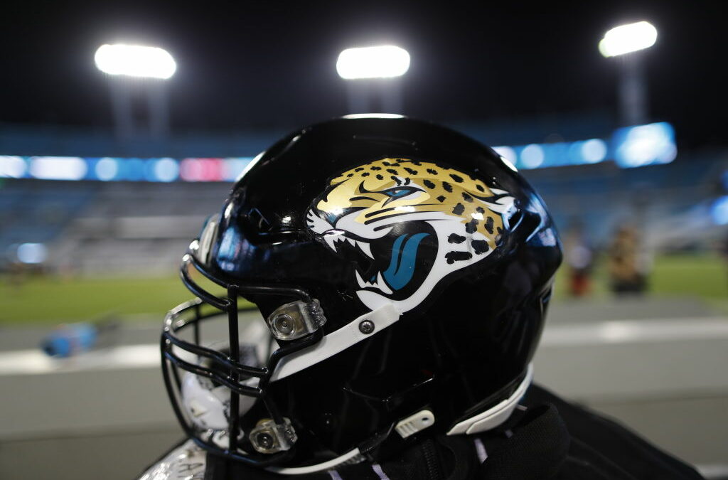
Before the arrivals of quarterback Trevor Lawrence and head coach Doug Pederson, the Jaguars were mired in long-term disarray.
Blown early-round draft picks, constant coaching changes and hundreds of millions of dollars spent on free agent signings wasted. And when a team just keeps on losing, it’s easy to be turned away by their logos and uniforms since they’re not synonymous with winning and happy memories.
But we’ve long been fans of each logo the Jaguars have used throughout their history. The current one, introduced in 2013, has a better color scheme and a much more menacing look than its predecessor.
The old one got the job done, so to speak, but was a little too cartoony. The modern one looks a lot more realistic but also more angry and fierce. The logo and team name went well with the short-lived “Sacksonville” era that was highlighted by a trip to the 2017 AFC Championship Game.
Now that the Jaguars have T-Law and Pederson, you can expect plenty of winning to take over Duval County. And that means this logo will earn more well-deserved love, recognition and exposure over time.
Good, it’s long overdue. Because this is, in every aspect, one of the NFL’s premier logos. Plenty of sports teams are named after a cat — hello, Detroit Lions, Detroit Tigers and Chicago Bears, oh my! — among others. But few clubs with a cat-themed name made their logo as cool as the Jaguars here.
San Jose Sharks
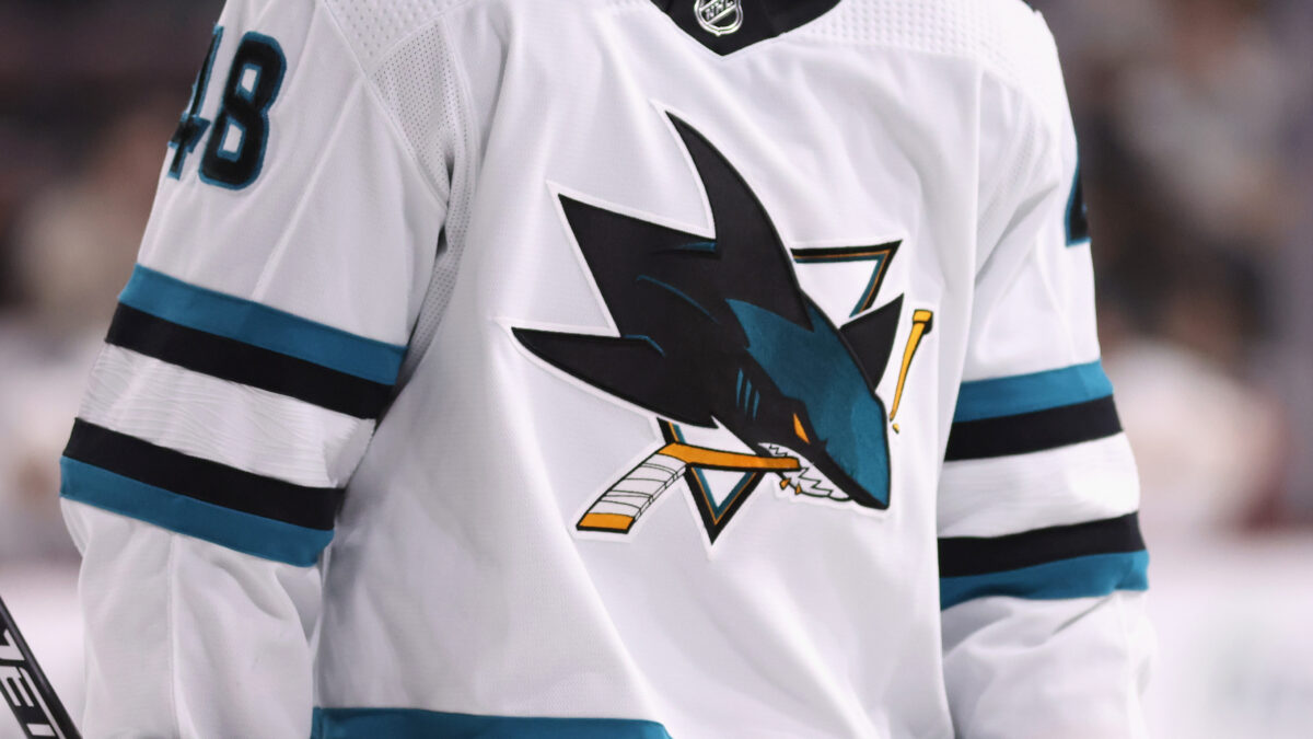
“San Jose Sharks”. What wonderful-sounding alliteration. The team name, the jersey and the logo all work perfectly as well. What isn’t there to like about them other than maybe the team itself? Looking at you, Anaheim Ducks and Los Angeles Kings fans.
The Sharks’ main logo design has been mostly kept intact since their inaugural 1991-92 season. For the 2007-08 campaign, they made a slight change, with the top of the shark’s head being switched from black to teal. The shark’s eye color was also switched to a dark-orange color.
Whichever logo throughout their history you want to take, it will always be classified as underrated to us.
They’re not a big market team, and their national following outside of the Bay Area isn’t exactly huge. The Sharks are also much younger than most other professional sports teams, so their logo isn’t all that iconic and universally recognized, if you will.
If you take the historic aspects out of the equation — specifically the Original Six NHL franchises — this might be the best logo in all of hockey. It’s super artistic and fierce-looking, and the shark-biting-through-the-hockey-stick was mixed in perfectly.
Milwaukee Bucks
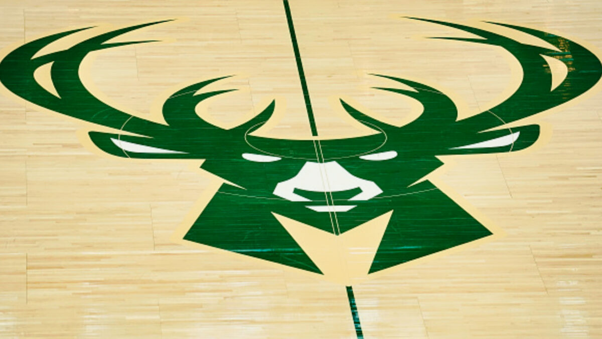
The old Bucks’ logo, used from 1968 to 1993, worked back in its day. It was a cartoon-style happy-looking buck in a green Christmas-like sweater spinning a basketball.
Again, cartoon-like sports logos were very popular at the time. But for the 1993-94 season, the Bucks introduced an angrier-looking Buck with a triangle in the background and a font that read “Milwaukee Bucks.”
The Bucks changed up their color scheme for the 2006-07 season, which was admittedly a better look than the old one, but still not as cool as the modern one.
The present logo, introduced for the 2015-16, is simply where it’s at. The buck looks a lot more intimidating, assertive and territorial. And the darker colored schemes make this look less cartoon-y than its predecessors.
The “Bucks” team name as well as the logo also fits in so well for a team that owns the world’s best player in Giannis Antetokounmpo. He’s a freak of nature and not someone to mess with, just like a buck out in the open wilderness.
Seattle Kraken
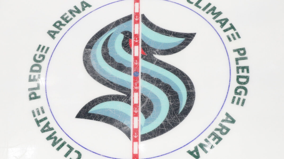
The youngest NHL franchise chose the team name “Kraken”. The Kraken is the name of a mythical sea monster creature that was said to live in the waters around Norway.
With the Kraken being the youngest NHL franchise, it’s going to take some time until their logo gains more love, attention and recognition. But as it stands now, this is simply one of the most underrated in all of sports.
The logo designers just made this so beautiful in every aspect. The “S” is creatively shaped into the initial but also looks like an intimidating and ferocious Kraken sea monster. The red Kraken eye is the perfect cherry on top of this logo.
Plus, y’know, it’s a unique and cool team name choice. We have enough real-life animals as team names in the sporting world, but a mythical creature like the Kraken just works nicely for a hockey team.
Release the Kraken!
New York Mets
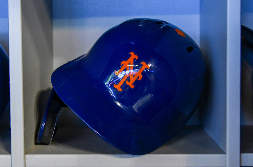
The New York Yankees have the far more recognizable and legendary logo, but the Mets aren’t to be overlooked either.
Mets, of course, is a shortened word for the term “Metropolitans”. The team name also pays homage to an old baseball team in the big apple called the “New York Metropolitans”, who played in the American Association league during the 1880s.
Popular cartoonist Ray Gotto designed the logo, which was revealed in 1961. It has seen very minimal changes throughout its history, and rightfully so. Why change something so beautiful that New Yorkers have embraced and donned for over six decades now?
This logo is gorgeous because of its colors — orange, navy and white — and the creative art design. Gotto beautifully implemented a bridge and New York’s signature skyline — including the United Nations building and the Empire State building. And it’s all shaped into a baseball with an orange font that reads “Mets.”
It just has everything you want in a logo. Nice colors that standout, creativity and a nod to some of the city’s landmarks.
Baltimore Ravens
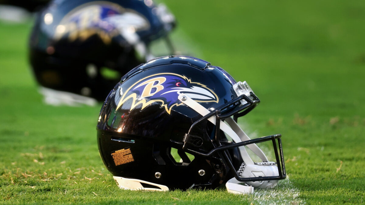
The Ravens, of course, were initially the Cleveland Browns before relocating to Baltimore in 1996. Then-owner Art Modell opted for a new team name, logo and uniform color upon moving the franchise.
For the good folks of Baltimore, the call was easy: “Ravens.” Why, because well-known poet Edgar Allan Poe spent much of his life in Baltimore, and he’s also buried there. And of course, many of you probably studied his poem “The Raven” while in high school.
The Ravens did a wonderful job designing their logo into a menacing-looking bird here. When you think of birds like ravens, you think of “defending the nest.” So that ties in nicely to an NFL team which has the responsibility of “defending” its end zone and home field!
The color combinations for this logo are just perfect, and the “B” for Baltimore on the Ravens head is implemented nicely. Legends like Ray Lewis, Jamal Lewis, Jonathan Ogden, Terrell Suggs and Ed Reed quickly put this team on the map — and the Ravens’ rapid rise to dominance in the early 2000s added more significance and attention to this savvy-looking logo.
You won’t find many folks who put the Ravens’ logo up there with the best of the very best. But in terms of colors, design and the story behind it, this is among the NFL’s premier logos.
What do you think is the most underrated logo in sports?


