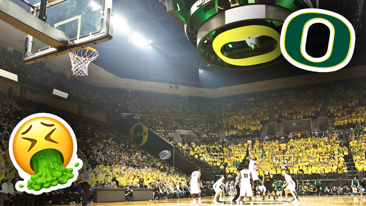
Not all college basketball arenas are created equal, and that is especially true for some teams in lower conferences. However, there are some big-time schools whose arenas are either extremely outdated or just simply bad.
Without further ado, here’s a list of the 10 worst Division I basketball arenas.
ARC – Valparaiso
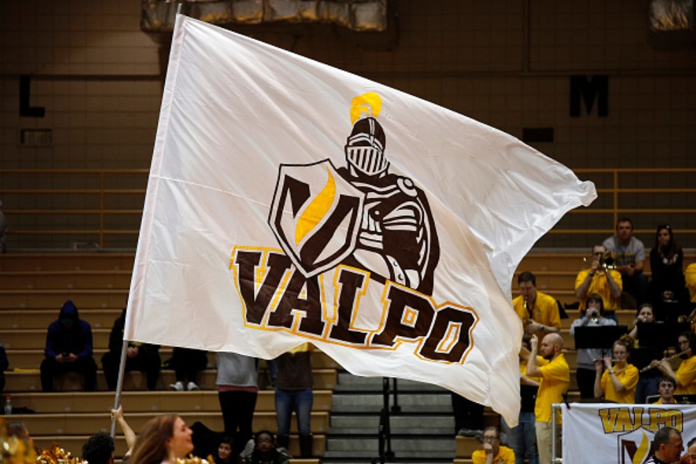
The ARC has hosted Valparaiso basketball since 1984, and even when it opened, it was not a great arena. It is a glorified high school gymnasium, which isn’t a problem if it still looks good, but the ARC doesn’t.
On one end of the floor, there are seats behind the basket, but on the other end, the scorer’s table is pretty much the only thing that stands before the wall. The arena is off-centered, which isn’t necessarily a bad thing, but the amenities are some of the worst in college basketball, too, which earns the ARC a spot on this list.
Memorial Gymnasium – Vanderbilt
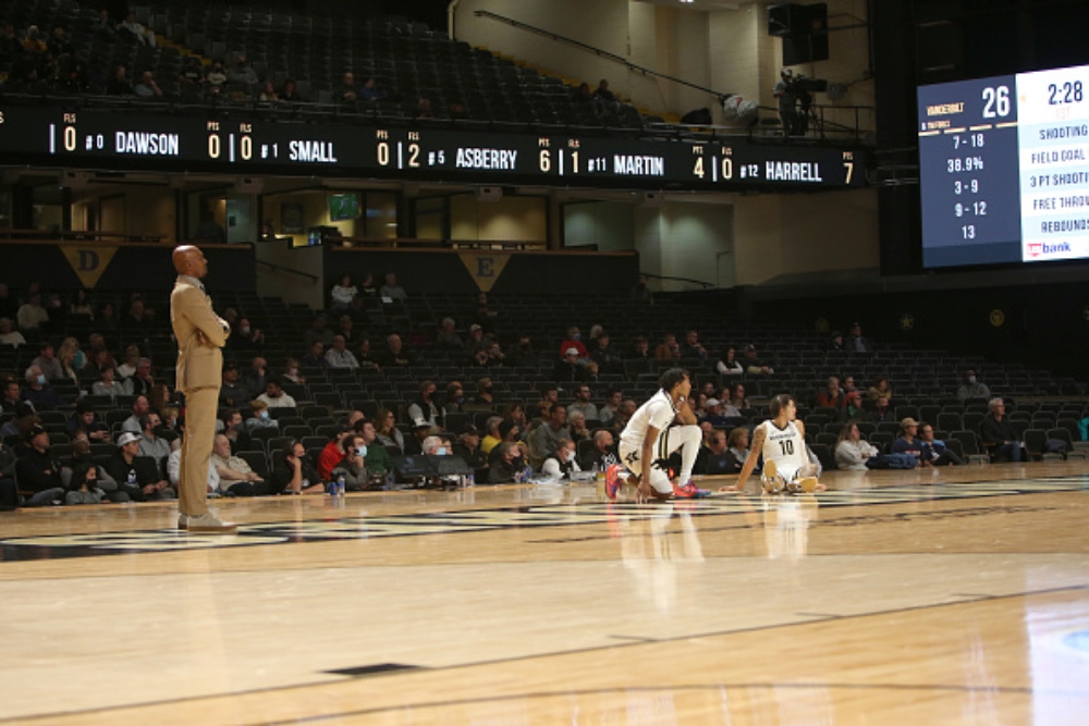
Vanderbilt’s arena is here for one simple reason: the floor. The floor at Memorial Gymnasium is raised, which isn’t always a bad thing, but the empty space on the floor is an eyesore for both television viewers and people in attendance.
Click on ‘Follow Us’ and get notified of the most viral Basketball stories via Google! Follow Us
Add in the fact that the team benches are on the baselines and that the baskets look awful (because of how far away from the court the bases are), and Memorial Gymnasium is an arena that is not well suited for the eyes.
Matthew Knight Arena – Oregon
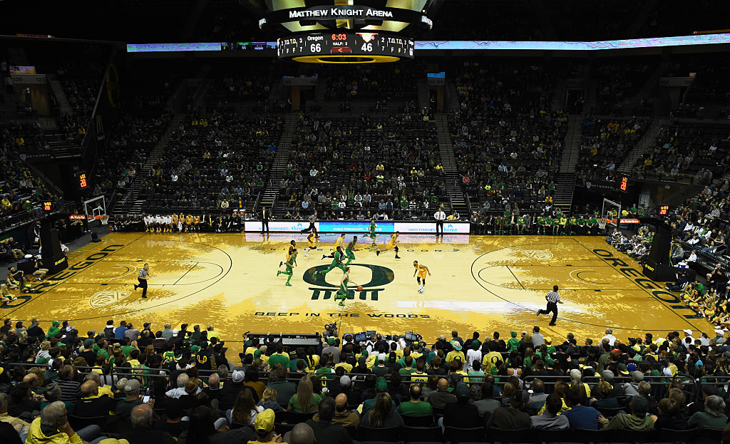
The Matthew Knight Arena, itself, is not as bad as some of the arenas on this list, but, like the Memorial Gymnasium, it finds itself on this list because of its floor. The court has a design where darker shaded evergreen trees protrude in from every side, and because the court’s shading is odd, it makes watching a game there painful.
The lines on the court don’t stand out very well from the rest of it, and in the middle of the court, where there is the name of the floor (Kilkenny Floor) and a slogan (Deep in the woods), the words are tough to read because they move across the edge of the darker and lighter shaded parts of the floor. Overall, a sloppy floor design has killed what was, at one time, a very good arena.
Ocean Bank Convocation Center – FIU
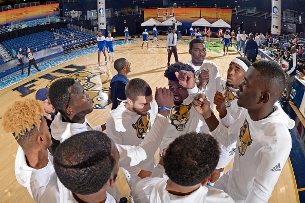
The Ocean Bank Convocation Center has been host to FIU basketball since 1986, and the arena commits the cardinal sin of looking like a high school gymnasium while also having an ugly floor. The floor design is based on a beach, where one side is colored like sand and the other side is colored like water, and both corners on the sand side have palm branches reaching out onto the floor.
Additionally, the arena is bare behind one of the baskets, while the other side has limited seating where the pep band sits. An awful floor and awkward seating arrangement is what has relegated the Ocean Bank Convocation Center to this list.
Climate Pledge Arena – Seattle
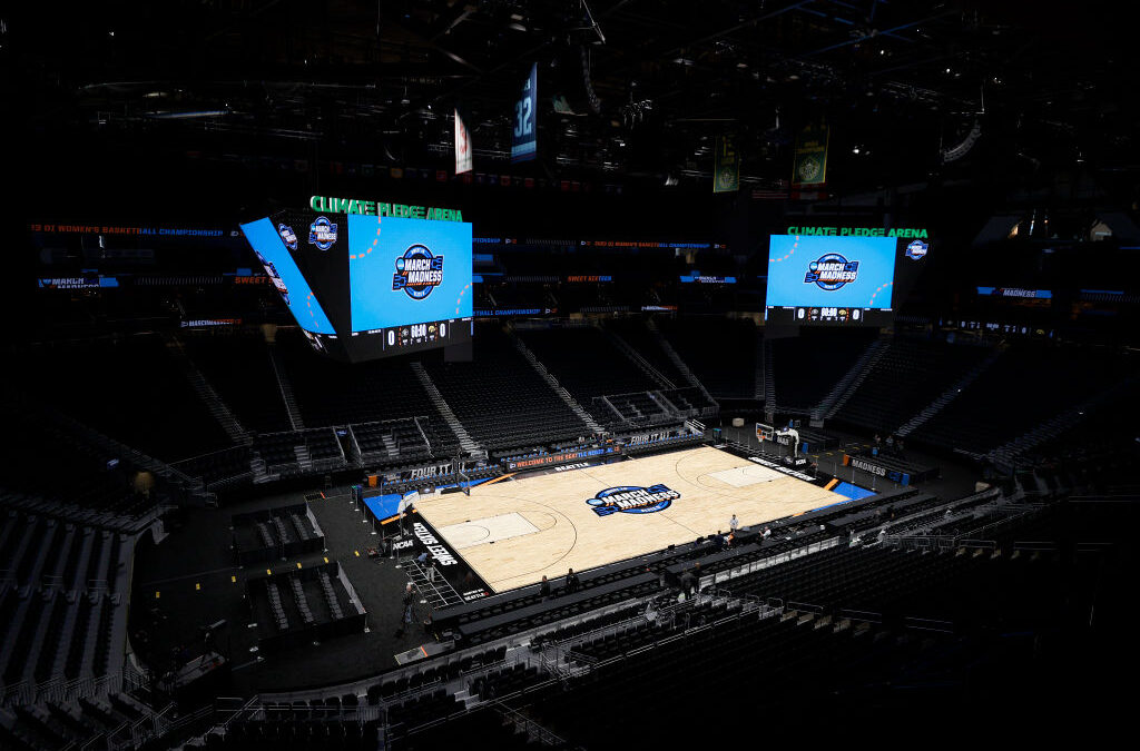
Seattle’s former arena, the Redhawk Center, certainly belonged on this list, but their new arena, which is also the home of the Seattle Kraken and Seattle Storm, has an argument for being one of the worst in Division I, too. The 18,000-seat arena is fine when the Kraken or Storm are home, but the arena looks empty when the Seattle Redhawks are playing there.
Additionally, the floor is awkward, but it isn’t as bad as some of the other floors on this list. However, the design of Mt. Rainier on either side of the floor doesn’t mesh well with the rest of it, but it doesn’t take away from the arena as much as some others do.
Provident Credit Union Event Center – San Jose St.
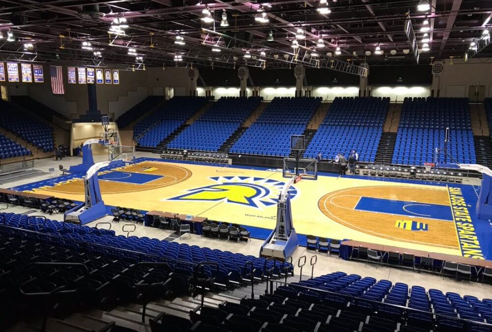
The Provident Credit Union Event Center is one of the rare examples where something that was already bad is made worse during a renovation. The arena has always been below average, but it was never among the worst in college basketball until 2023 when they re-designed the court.
The court is arguably the ugliest one in college basketball, with a blue and yellow design that glows in the dark. However, the fact that it glows in the dark doesn’t matter when games are going on, as there are always lights on when the teams are playing. It’s another example of trying too hard to be different, but this time they went too far and ruined something that wasn’t bad to begin with.
Memorial Athletic and Convocation Center – Kent St.
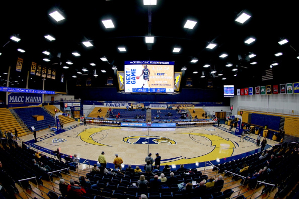
As the home of the Golden Flashes since 1950, the MAC Center is certainly showing its age at this point. The bottom level of the arena consists of pull-out bleachers that go directly down to the court, and above the bleachers are permanent seats that haven’t been renovated or replaced in years.
The court has too much going on, as well, as there are two separate lightning bolts that cover about half of the floor combined, and where the court isn’t covered by the lightning bolts, it is covered in a checkerboard pattern that further detracts from the game going on. If the school’s goal is to take focus away from the basketball being played, they have certainly done that.
Williams Arena – Minnesota
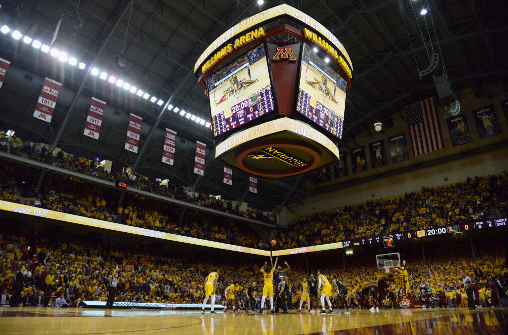
“The Barn,” as it is known by fans of the Gophers, is one of the oldest college basketball arenas in the country, but it is showing its age after 96 years of service. It is one of the few arenas to still have a raised floor, but, unlike Vanderbilt’s floor, Minnesota’s doesn’t look bad.
The major issue with Williams Arena is that many seats are partially obscured from the court because of the design of the building. The only way to rectify this issue would be to remove the seats or complete a massive renovation that would likely change the entire identity of the building.
Dee Glen Smith Spectrum – Utah St.
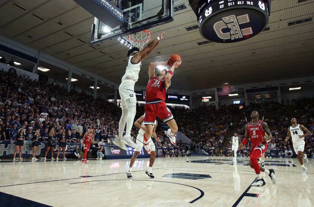
Utah St. has one of the best home atmospheres in the NCAA, and overall, their arena is decent, but there is one glaring problem that condemns the Smith Spectrum to rot on this list: the seating arrangement. The seating arrangement has red, yellow, orange, and brown seats seemingly thrown about in a random arrangement of colors that will make your eyes hurt if you look at it for too long.
There is no rhyme or reason to how the chairs are set up in the building, and if the arena isn’t full one day, the seating arrangement will take away from the viewing experience, which isn’t really fair to the team, as they have traditionally been a decent squad.
Ed and Rae Schollmaier Arena – TCU
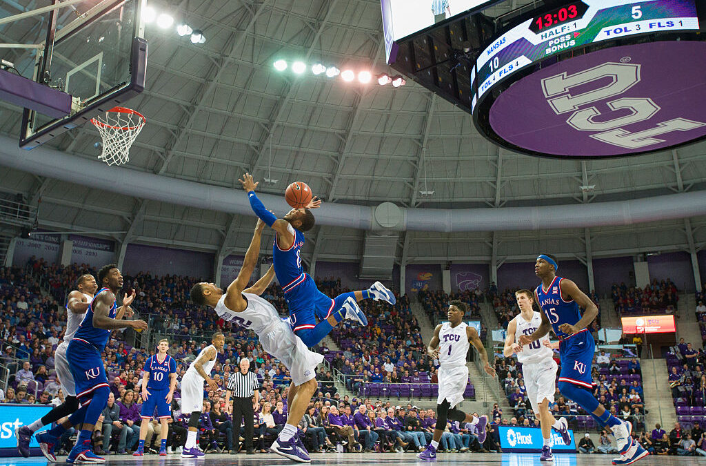
The Schollmaier Arena has been home to TCU Basketball since 1961, and it has traditionally been a decent arena. However, similarly to Oregon’s arena, a recent renovation, specifically of the court, has made the arena into one of the ugliest in the country.
The new court has an awkward design, where a weird geometric pattern of alternating shades of gray is only broken by the black and purple design of the logo and paint. The rest of the arena is decent, even if it is unspectacular, but the court ruins it.


