As sports fans finding out our favorite teams logos has a hidden meaning or message is amazing.
Plenty of sports logos have a so-called hidden meaning somewhere within them, but some of them are so well-known that they’re not really “hidden” anymore.
We’re here to give you a fun history lesson, folks. If you caught on to these hidden meanings in the past, we tip our hat to you. Before we reveal the answers, pay close attention to each logo and see if you can figure out the hidden meaning.
So let’s get right to it.…. Today we present 12 College Football Logos With Meanings And Hidden Images
12. Tostitos Fiesta Bowl
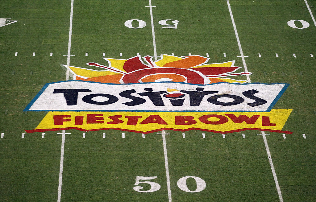
Well, this was certainly the TASTIEST College Bowl game…if you catch our drift.
Unfortunately for us tortilla chips and salsa lovers, Frito-Lay announced in June 2014 that they would no longer continue their association with Tostitos for the Fiesta Bowl. Frito-Lay reportedly said the decision was made so that they could look at different strategies for marketing.
Click on ‘Follow Us’ and get notified of the most viral NCAA stories via Google! Follow Us
But for 18 years — from 1996 to 2014 — we were treated to, again, a very tasty Bowl game name. And hey, there was that very tasty-looking logo that carried a hidden meaning that many of us never noticed…until recently.
Take a look at the “I” in “Tostitos, as well as the two “T’s”. You’ll notice there are two people holding up a tortilla chip above a bowl of salsa. Yup, Tostitos found a way to really promote their brand in that logo.
Vizio sponsored the Fiesta Bowl in 2014, followed by BattleFrog for one year in 2016. Since December of that year, PlayStation has been the sponsor of the Fiesta Bowl. And unless we’re missing something, there doesn’t appear to be any hidden meaning in the current Fiesta Bowl logo.
11. Missouri Western State Griffons
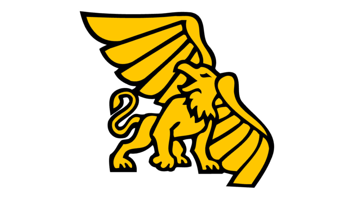
You might not be too familiar with the Missouri Western State Griffons. They’re a division two team, and they participate in the Mid-America Intercollegiate Athletics Association. Los Angeles Rams kicker Greg Zuerlein attended this school.
Now, take a close and careful look at the Griffons logo. There are no Harry Potter references or anything, so don’t get excited. For those of you who are good at Geography, you may have noticed that the “Griffon” depicts the shape of Missouri.
This logo isn’t only significant because of the special way it pays homage to the state of Missouri. But according to Medium.com, the school’s Sports Director in the ‘70s, Jerry Meyers, had one of his pals create the Griffon logo. This was then used to help recruit students from outside the university.
The school rolled with the name “Griffons” and the beloved “Max the Griffon” mascot was born.
10. Washington State Cougars
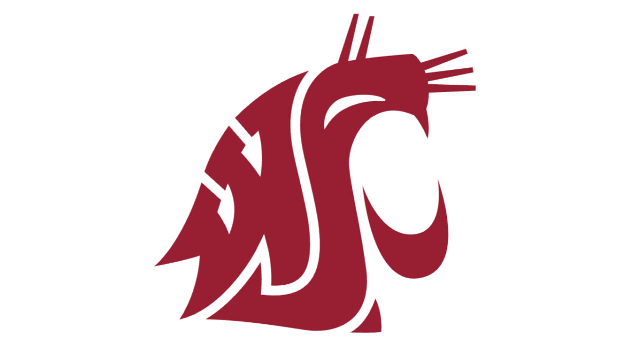
Washington State isn’t the only NCAA team with the “Cougars” name. The Houston Cougars exist too, and their logo is pretty simple. I mean, without even knowing the team name by heart, you could just look at the logo and see a cougar right away, it’s so simple!
But imagine not knowing anything about the Washington State Cougars. Somebody presents the logo and asks you to guess their name. It’s nearly impossible to guess. I mean, it almost looks like a knockoff of the Chicago Blackhawks logo.
Okay, well, actually you can see the whiskers and the open mouth. But did you notice the letters W, S and C in the logo? There you have it. The school name initials are right there in the shape of a cougar. Debate all you want if it’s pretty. We’ve definitely seen better. But give ‘em credit for coming up with something tremendously creative here.
9. College Football Playoffs
In 2014, NCAA began the current playoff format where four teams would meet and vie for the national championship. Two semi-final showdowns take place every year to determine the winner. Maybe one day they’ll just put Alabama in the finals by default then put Clemson vs. Ohio State in the lone semi-final matchup.
Anywho, the College Football Playoffs logo looks like nothing special. Just a football shape with the four laces in the middle.
But the four laces represent the final four teams that are clashing for the national title. According to the College Football Playoffs, the “two gold brackets surround a ‘virtual football, and allude to the championship trophy.” Also good to know!
In case you didn’t know, there was also a voting contest to determine the logo. Have a look at the other three nominees here…Nothing too fancy. We won’t ever complain about a logo with SOME creativity, so we’re glad this one took the nod!
8. George Washington University Colonials
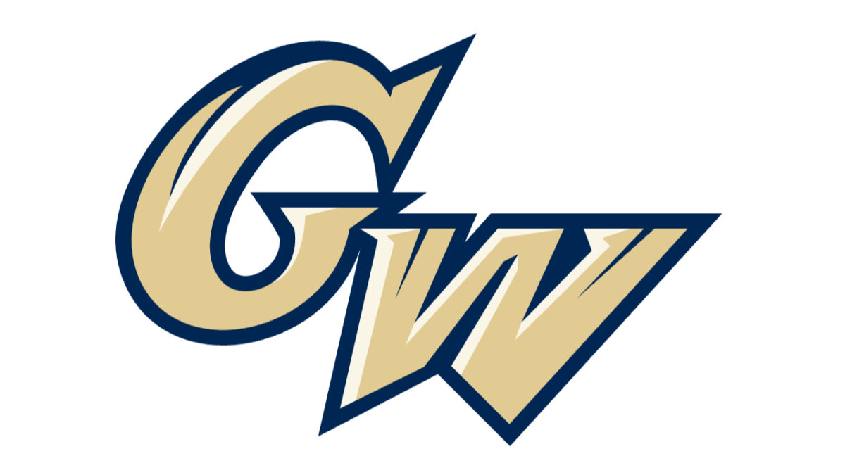
At first glance, the logo for George Washington University seems to be the simple “GW” initials. Nice gold and navy colors and all, but nothing unordinary, right? Lots of teams just use initials for their logos, after all.
But even history buffs probably struggle to notice the hidden meaning in this logo. Take a VERY close look at the “W” in this logo, and you’ll find the Washington Monument that’s located in the nation’s capital.
This well-known landmark was designated in 1966, and the university decided to adopt the landmark as part of their logo. On a side note, maybe optometrists in D.C. should use this logo during vision tests to see if their patients can spot it.
7. University of Miami Hurricanes
Unless you attended the University of Miami, there’s a very strong chance that you don’t know the story behind this logo. I mean, how many universities are there in the United States? A lot. So why would anybody adopt the “U” for “University?”
Well, it’s a cool story for the Hurricanes. The school had different logos for many years, maintaining the green and orange colors. But in the ‘70s, the school decided it was time to change things up.
Bill Bodenhamer — a Miami-based designer who helped create the Miami Dolphins’ NFL logo — constructed the legendary Hurricanes’ “U” logo. So what’s the story? The “U” stood for slogans such as “U Gotta Believe,” “U Moving Forward” and “U is great.”
That one letter then swept across the school; it’s even become common for students at Miami to form a “U shape” with their hands during games.
6. University of Hawai'i Rainbow Warriors
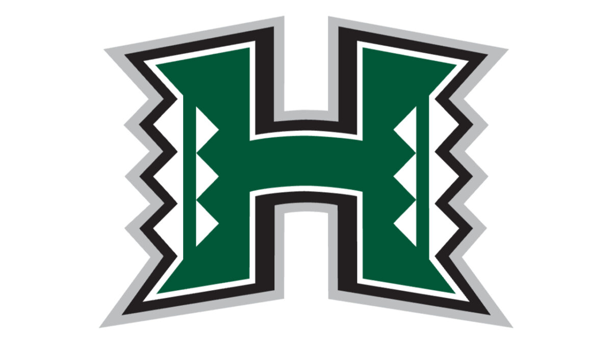
Okay, this looks like nothing more than a simple “H,” which obviously stands for Hawaii. So what’s the story?
According to the University athletics’ website, the “H” also stands for “Ha,” which means “to breathe” in Hawaiian. It also outlines as follows on the website:
“breath – the spirit of life passed on to us from one person to another, generation to generation, with its lessons and success.”
Also, the triangles on the Rainbow Warriors’ logo carry a special meaning: They represent the body, mind and spirit. In ancient Hawaiian culture, all three “values” needed each other – that is, neither the body, mind or spirit would work without the other.
5. Eastern Washington Eagles
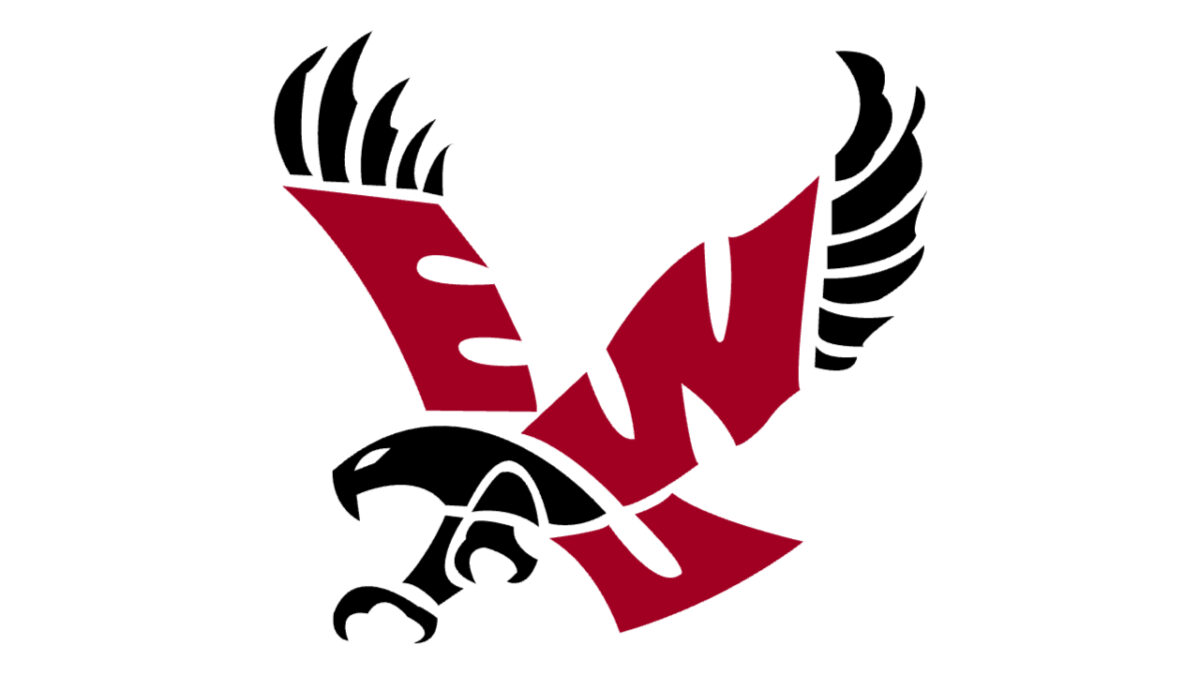
Eastern Washington University in Cheney, Washington is the alma matter for well-known sports journalist Colin Cowherd and Los Angeles Rams star wide receiver Cooper Kupp. The Eastern Washington Eagles’ logo carries a special hidden meaning like the NFL’s Philadelphia Eagles.
As we mentioned earlier, there’s a Hidden “E” in the Eagles’ logo. Well, Eastern Washington’s logo of the Eagle carries red and black colors. Take a look at the red part of the Eagle, and you’ll see the letters “E-W-U,” which obviously stands for Eastern Washington University.
I suppose the E and W are easy to make out, but it’s easy to overlook the U.
4. University of Arkansas at Pine Bluff Golden Lions
This school in Pine Bluff, Arkansas (duh) was founded in 1873. It’s one of the smaller schools that’s part of the NCAA. In September 2016, the school announced an enrollment of 2,821. So yes, it’s not the biggest and most well-known university in the United States.
UAPB was home to a handful of NFL players, including New Orleans Saints offensive tackle Terron Armstead. The Golden Lions play in the West Division of the Southwestern Athletic Conference. They also won the Conference Championship in 2012.
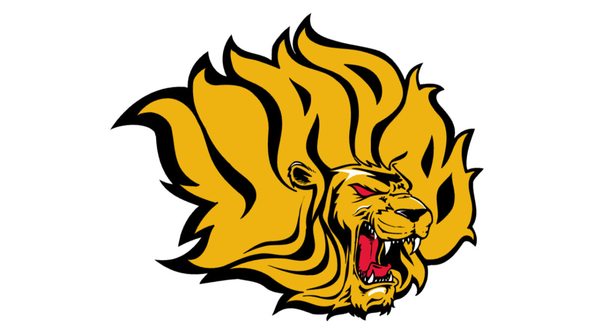
Anywho, the Golden Lions have a logo that depicts, well, a Lion that happens to be golden! Can you believe it? But it could take somebody hours to FINALLY catch on to the hidden meaning in this very logo.
Take a look from left to right, and you can make out the words U, A, P and B…the initials of the school.
3. Big Ten Conference
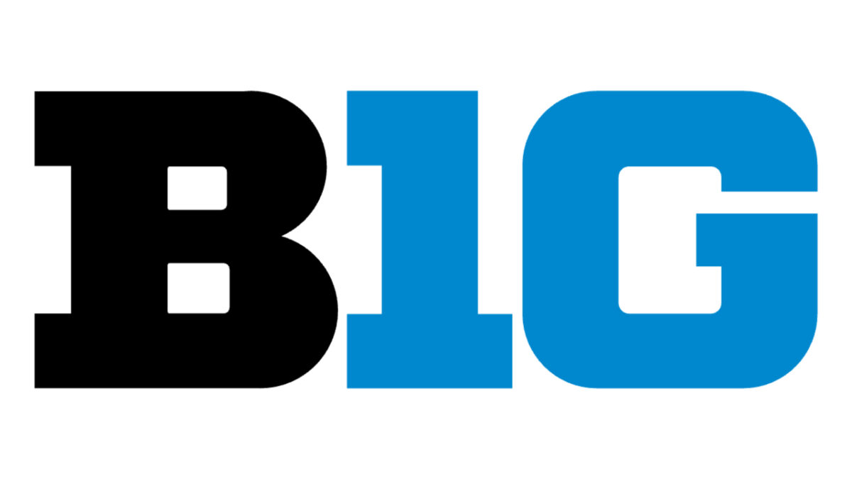
Being named the “Big 10” Conference, this Division 1 conference was once home to…you guessed it…10 teams. In 1990, the Penn State Nittany Lions joined the conference, but the decision was made to keep the “Big Ten” name.
So how did the NCAA go about changing the logo? It still read “Big 10 Conference.” But did you notice the odd shape in the “T”? You’ll notice there is a number ONE on both sides of the T, which depicts the number 11. That, of course, was to pay homage to the fact that the Big Ten was now The Big Eleven.
But yeah, still kind of funny that they kept the name “Big Ten” when it was really the “Big 11”. At least the logo acknowledged the Nittany Lions’ entry into the division.
2. Hofstra Pride
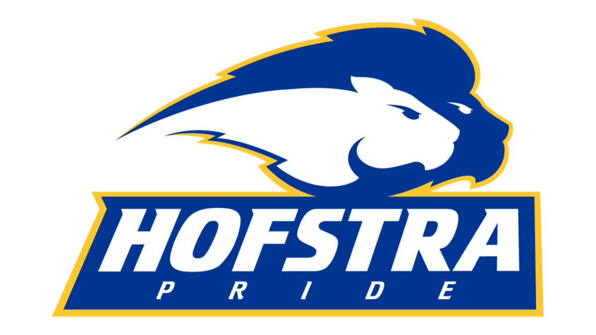
Hofstra University in Hempstead, New York has a logo that looks somewhat similar to that of the Buffalo Sabres’ NHL team. Except, the Pride have a very special meaning inside their logo, which seems unnoticeable at first glance.
But it’s anything but fairly average once you get to know the story. As everyone knows, “pride” is a term used to describe a group of lions. Well, Hofstra’s logo depicts more than one lion. Hence, it’s a pair of Lions…so they’re called the “Pride.”
Interestingly, Hofstra’s old team name was actually “The Flying Dutchman.” The school was named after William S. Hofstra, a well-known American lumber who was born to Dutch immigrants.
The team name was eventually changed to “Pride”. In the 1980s, the school had two lion mascots – one male and one female. So it made sense to change the name to “Pride.”
There’s your story. Now go tell your friends.
1. Oregon Ducks
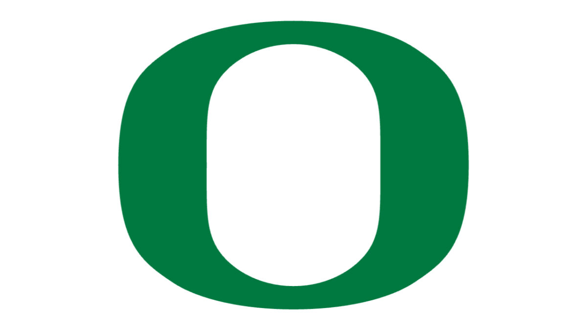
The logo looks ALL so simple at first. Hey look! It’s just an “O,” the initial for “Oregon.”
Notice the “U” shape inside the O? Well, that depicts the shape of Hayward Field at the Oregon campus. This field has been used by the school’s track and field team for a century. It’s one of the most famous track and field venues in the world, and it carries an important piece of the Ducks’ history.
The Oregon football team played at Hayward Field before moving into Autzen Stadium in 1967, where the Ducks have been playing their home games ever since. Still, Hayward Field has plenty of historic significance for the football team, and it’s only fitting that the logo pays homage to its first-ever venue.
But that’s only HALF the logo. The “O” represents Autzen Stadium, which is in the same shape. Take a look at the stadium overhead, and you can see it clearly.
Aren’t logos fascinating?
What other college football logos have hidden meanings?


