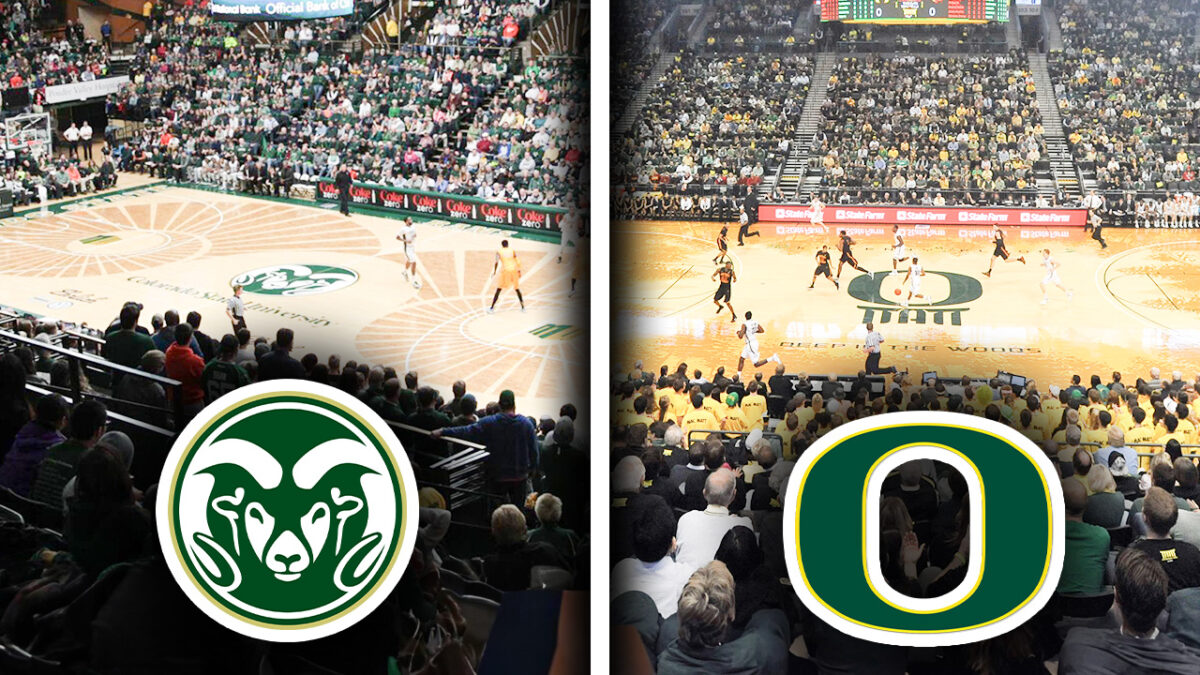
College basketball courts have a certain aesthetic. The smell of the polished hardwood and thousands of seats in the stands could motivate anyone to perform their best. But despite college basketball being a beautiful game, there are some ugly courts. Here are the ten ugliest courts in college basketball right now.
10. WVU Coliseum, West Virginia
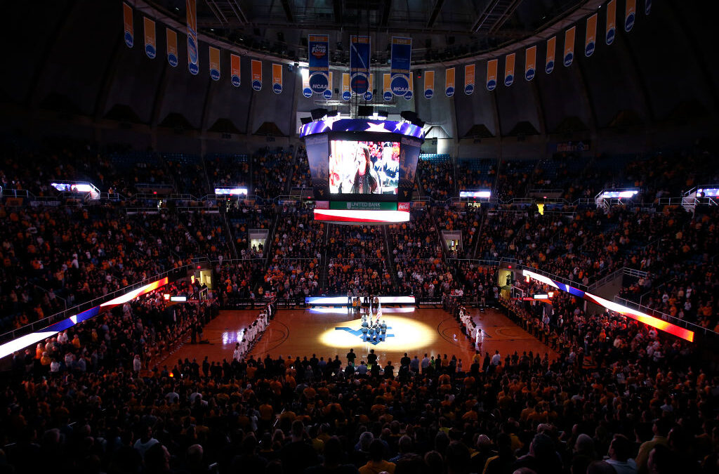
West Virginia’s yellow is pretty gross; this extends to their classroom. The hardwood yellow is an eye sore and looks like a highlighter on white paper. The amount of yellow on the court makes it tough to distinguish the three-point line versus being inside the paint. In addition, the WVU logo in the middle of the court doesn’t work, and it is just not fun to look at.
9. Pete Maravich Assembly Center, LSU
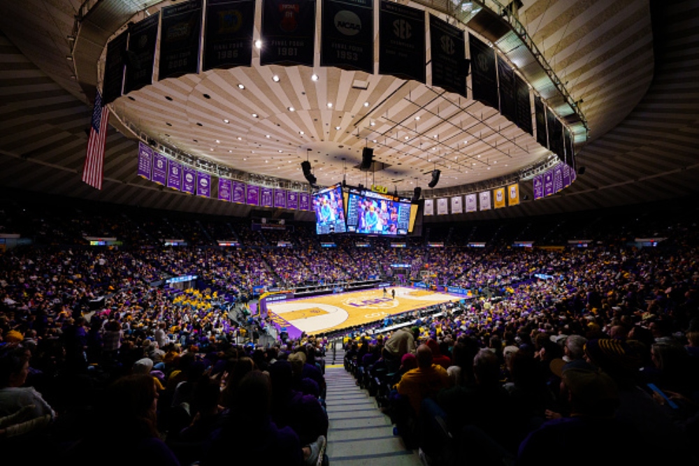
Despite having one of the most exciting teams in Women’s NCAA basketball, the LSU court is just not it. The logo in the middle of the court has “LSU” in Bold Purple on top of a faint cream-colored tiger. It is hard to make out that the logo is indeed a tiger, and it just doesn’t work for the court.
8. Moby Arena, Colorado State
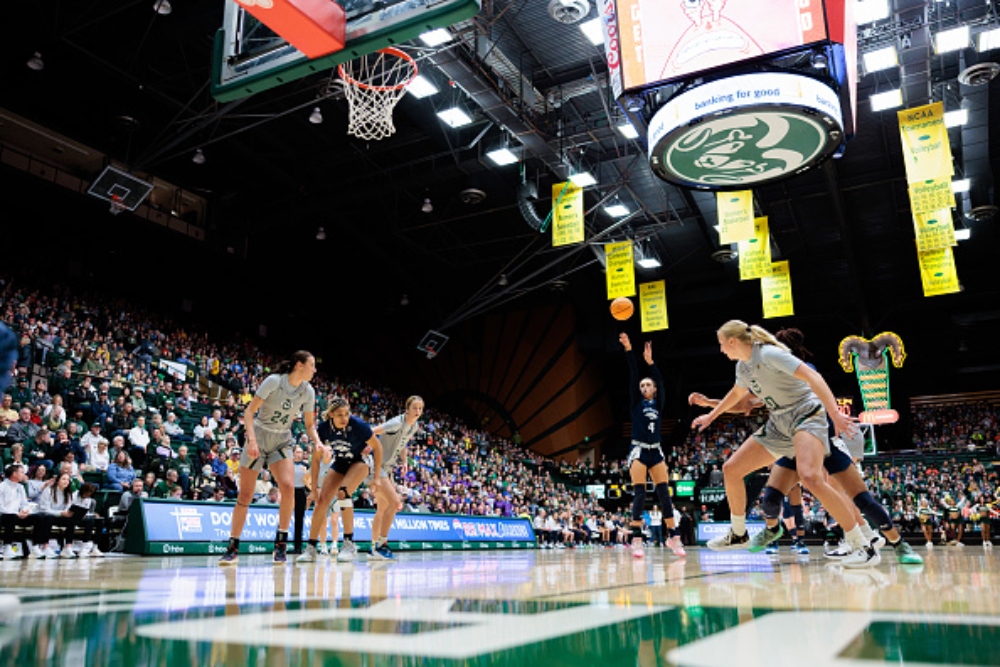
Not going to lie, at first glance the horns on the Colorado State court are cool. But, after looking at it for about five seconds; how the heck did the school get away with this? The ram horns are way too much for this small Mountain West school. The school essentially tried to do too much with the horns to the point where they looked like hypnotic swirls on the court.
Click on ‘Follow Us’ and get notified of the most viral NCAA stories via Google! Follow Us
7. BB&T Arena, Northern Kentucky University
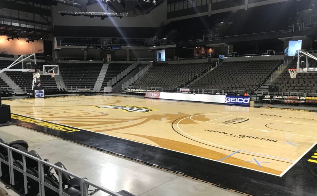
The Northern Kentucky Norse (like other courts around the nation) tries to incorporate a logo into the court, but the logo is way too overwhelming to the point where it’s hard to find where the court is. The pale hardwood floor looks like a piece of white paper that someone drew a yellow… something on. All in all it looks more like a third-grade drawing as opposed to a college basketball court.
6. Reed Arena, Texas A&M
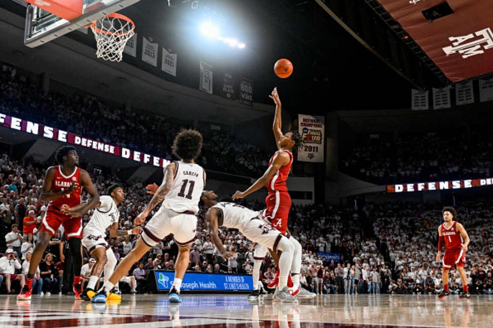
Sorry, are we playing chess or basketball? The checkered floor looks like a live-sized chess board and if you think about it each player is a pawn in the game. Poorly written analogy aside this court is definitely unique, but not in a good way.
5. Welsh-Ryan Arena, Northwestern
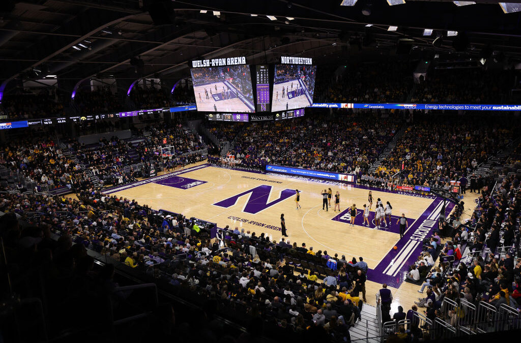
The Northwestern court is a boring basketball court with nothing to show off. The Northwestern logo is boring and poorly designed. It also looks like a toddler tried drawing block letters for the first time. The purple is popping too hard and almost looks forced. Granted, this is an upgrade from the previous home court, but it seems like just a lateral move.
4. FIU Arena, FIU
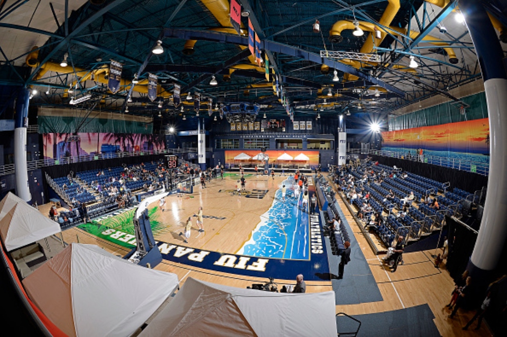
The fern leaves “overgrowing” onto the court are gross. It does not scream “basketball”, but instead it screams “overpriced vacation”. A basketball court shouldn’t give the same vibe as a beachfront cabana. The beachfront painted on one side of the court makes the whole hardwood look more like a Bob Ross painting rather than a basketball arena.
3. CFE Arena, UCF
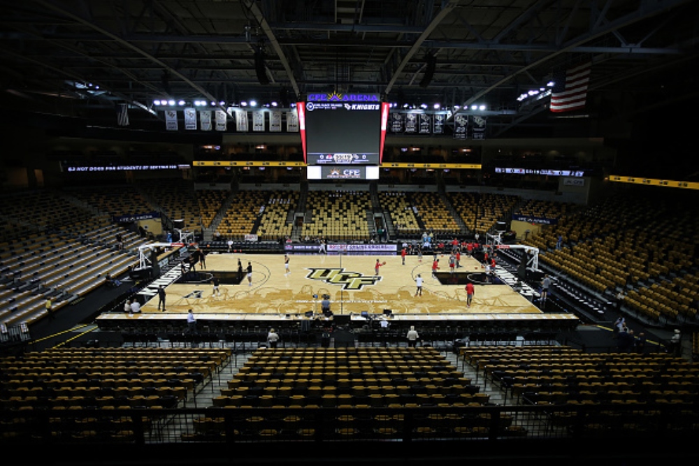
The UCF basketball court looks like the painters hired to design the court never completed their assignment. Most of the court is a sleek transparent black with the exception of everything within the ark. The dark black rectangle under the hoop signifies the inside of the paint, but they could have at least made it consistent with the rest of the court and made that transparent as well. Again, it looks unfinished, and it may be time to paint the rest of the court.
2. Icardo Center, California State Bakersfield
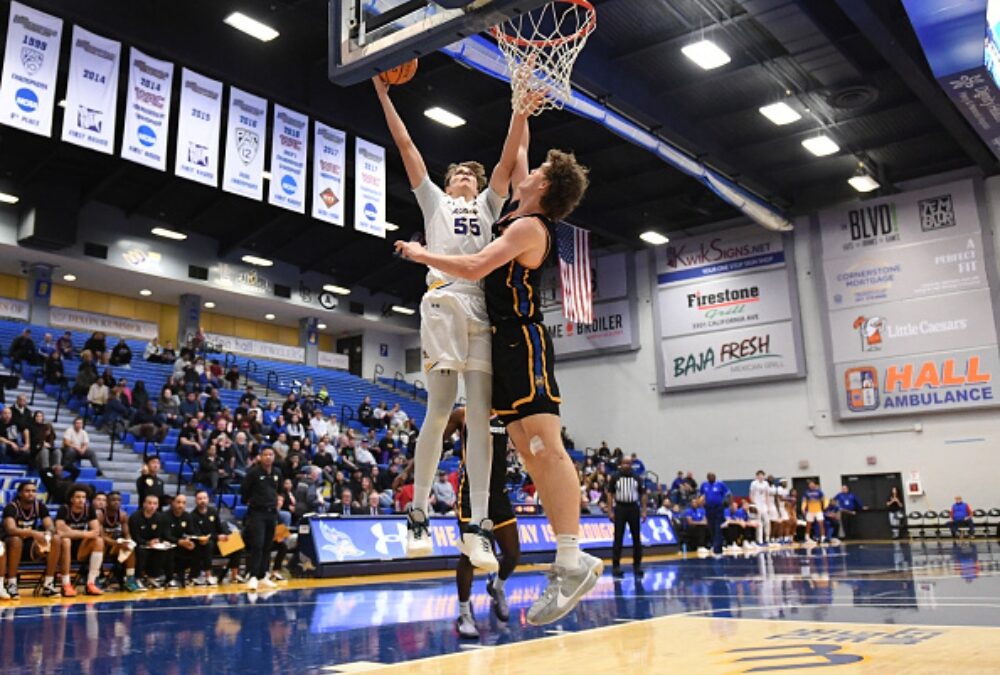
Cal State Bakersfield tried their best to stand out, and props to them because they did. The dark blue takes up most of the court, and the yellow outline hugs the perimeter. The light blue outline of the state of California is an eye-sore on top of the light blue. Then on top of that light blue California is the yellow logo. So, we have yellow, on light blue, on dark blue on yellow. Yikes.
1. Matthew Knight Arena, Oregon
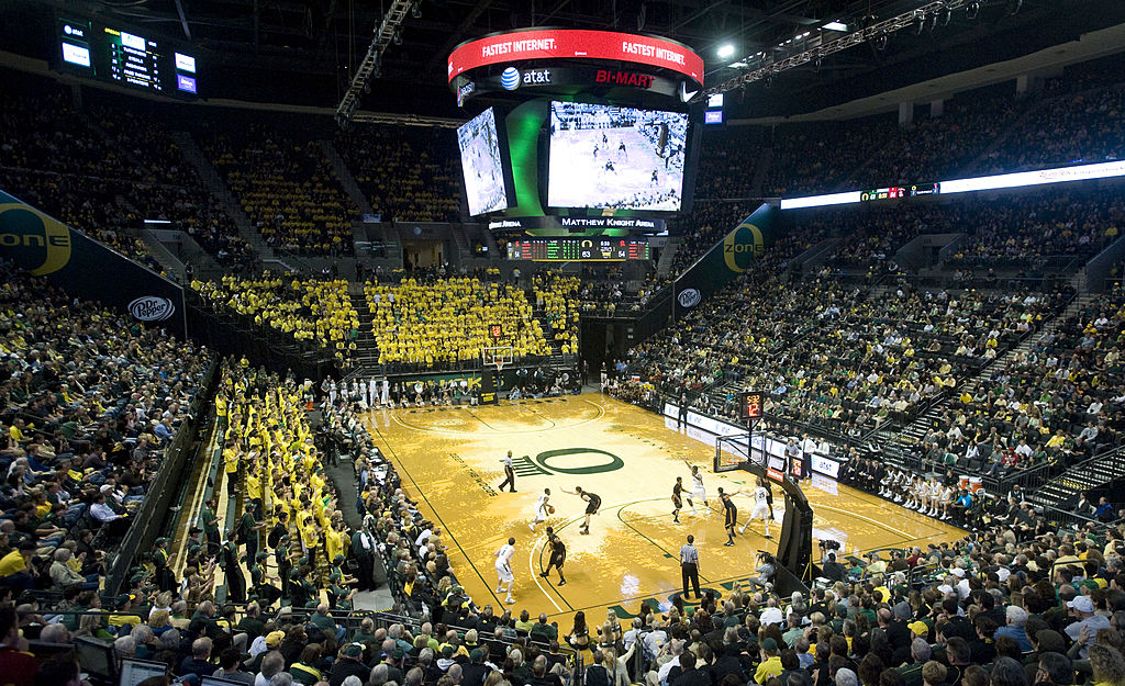
The thing about Oregon’s court is you either love it or hate it. Guess how we feel considering the court is on the top of our list. It would be one thing if all of the trees covered the entire court, not 75% of it. The trees are uneven as they point to the Oregon “O”, and the colors are way off. Watching the game on TV, it is hard to even tell what the trees are supposed to be. All in all, the Oregon Court is gross and for a school that worships Nike maybe it’s time to ask for a grant to get a new court.


