What were these teams thinking?
NBA logos are important to a team’s identity. There are a bunch of creative logos in the league and there are some who simply remained close to the original one throughout the years.
However, there are tons of team logos that badly missed the mark when it comes to the design. You can definitely say that each team has had at least one bad logo in their history but in today’s list, we will select 10 dumbest logos in NBA history.
Denver Nuggets (1976-1981)
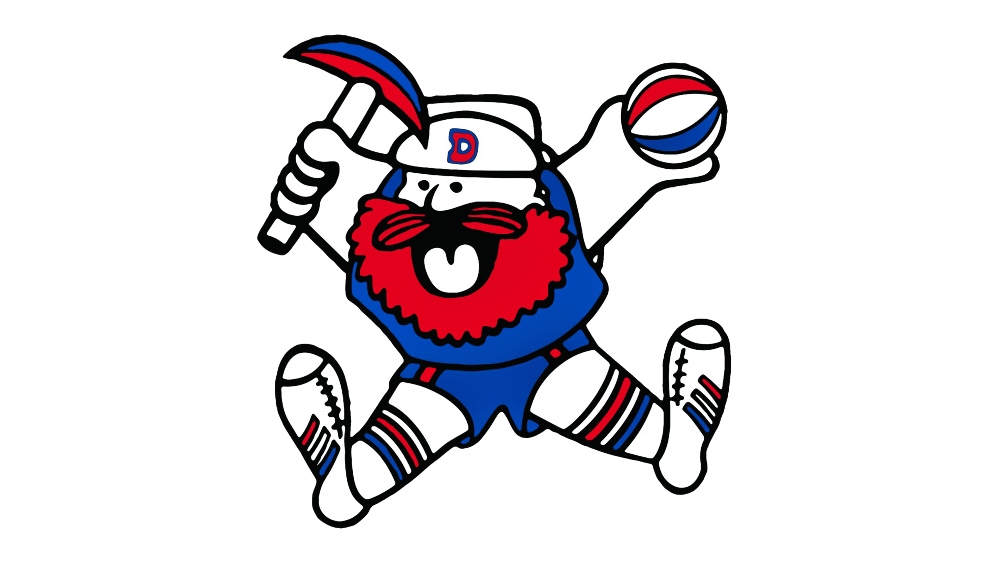
This logo is just bad on all levels. Rumor has it that a 4 year old made this and the Nuggets stuck with it (just kidding!). The hands are disproportionate and it essentially looks like he was excited to find a basketball lying somewhere in a mine rather than finding an actual nugget.
And what’s up with those shoes? Did Adidas sponsor those too? I’m not arguing with you if you’d mistaken them for a pair of socks because they do look like one. It also resembles a Converse/Adidas mashup that went horribly wrong.
Boston Celtics (1960-1968)
Click on ‘Follow Us’ and get notified of the most viral NBA stories via Google! Follow Us
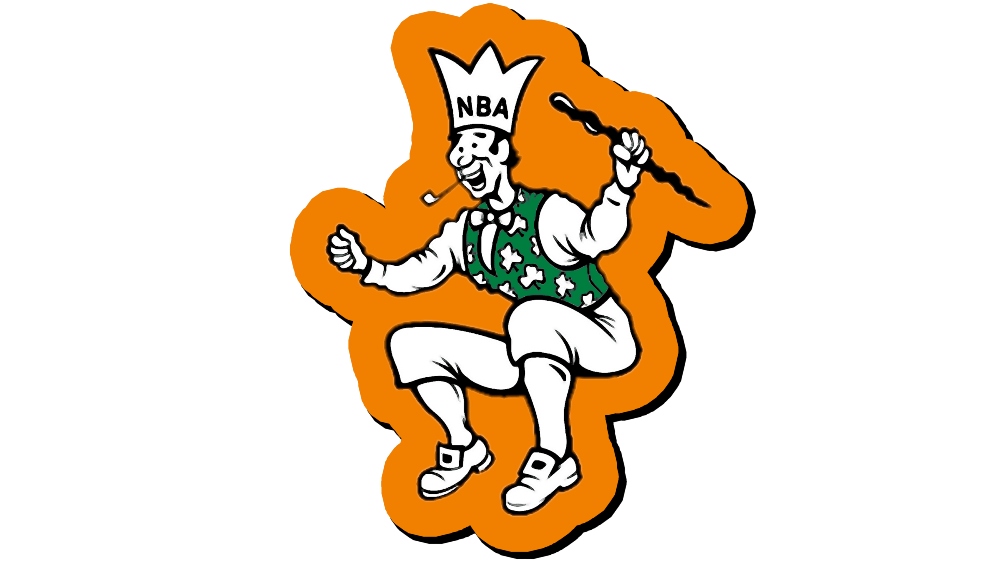
Believe it or not, this is the Celtics’ team logo during their dynasty run in the 60s. The sitting leprechaun just looks odd and cringey to anybody who looks at it.
We all understand that this was made during the hippie culture in the 1960s but the logo just looks plain dumb. It just doesn’t resemble a leprechaun and the crown on top is an unnecessary addition to this atrocious piece of trash. Plus, many fans pointed out that the man in the logo closely resembles them whenever they need to use the toilet. Ouch.
Golden State Warriors (1971-1975)
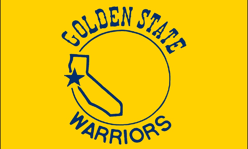
Since when did the state of California have a sun covering them up like that? Was there a time in history when the sun specifically popped out like another planet in California?
The blue version of this was bad too. If you took away the sun…err circle in the middle and aligned California to the center, this could have been a respectable logo but sadly, not all in the world is perfect. This is a prime example of overdoing a simple task to make it look more appealing but the result says otherwise.
Detroit Pistons (2017-Present)
Nowadays, logos are all about simplicity. However, Detroit’s alternate logo is just plain dumb and boring to look at. One glance and it looks like more of a ‘CP’ rather than a ‘DP’.
If you look at it for more than 10 seconds, your brain will trick you and the logo may resemble a silhouette of a hawk. It simply doesn’t represent the city of Detroit in any shape or form and fans aren’t happy about it.
Indiana Pacers (1976-1990)
When the Pacers merged with the NBA in 1976, they had a chance to make an awesome logo for the team but inexplicably stuck with their old one from the ABA. You don’t need a trained eye to look at the logo and conclude that it is not a hand holding a basketball.
Since when did the NBA endorse a tennis ball? The ball is definitely associated with tennis rather than what grown men are using in the league. We get it that they have an affinity to the color yellow but this logo was just a dumb concept to begin with.
Los Angeles Lakers (2001-Present)
While the Lakers rarely use this logo nowadays, this one still belongs in this list of dumbest logos ever in the league. With the Lakers’ logo history, they often went with simplicity as the team already has a huge following globally. This alternate logo ain’t it in all honesty.
This one, however, deserves to be retired for good. The huge L in the middle is such an eyesore. It is associated with the word ‘loser’ and that ain’t a good thing for LA fans anywhere.
Miami Heat (1999-2006)
The Heat should contact Google and pay a hefty sum to delete this awful-looking logo from the internet forever. Not only is it hard to read, but everything in it looks off-putting and messy.
This alternate logo closely resembles graffiti drawn by the not-so-cool kid inside your high school bathroom whenever he skipped a class or two. You can also argue that this is what your stomach is telling you when you eat something that’s extremely spicy.
New York Knicks (1946-1964)
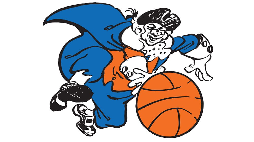
Believe it or not, this was the Knicks’ primary logo for nearly a couple of decades. Although it has roots and meaning for the city, this so-called ‘Father Knickerbocker’ looked like he just had a snack and decided to show off his basketball skills to his associates.
While old-school Knicks fans have defended this logo against online trolls, the hate towards this has been consistent throughout the years. Some even suggested that the mafia was the original owner of the Knicks back then.
Portland Trail Blazers (2002-2003)

There are no exact words on how to describe the logo this Blazers team had from 2002 to 2003. This is just plain bad and held no significance to the city and the franchise.
Maybe they were trying to separate themselves from the ‘jail Blazers’ moniker and created this logo to tell the world that they are to represent a new beginning. Or maybe it’s a call for help that the roster was on fire sale due to all the bad rep they had from the media? It’s all confusing.
Washington Wizards (2007-2011)
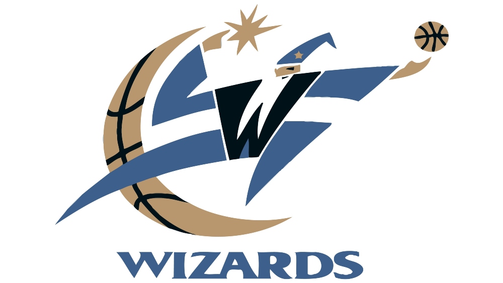
Even though the Wizards had some hideous logos in the past, for some strange reason, hardcore fans of the team are still advocating bringing back their old moniker, which is the Bullets.
Finding real wizards on the capitol will leave you disappointed and this alternate logo for the team is not an exception. It looks like it was drawn by a guy who had little to no experience with team logos. The W was unnecessary and the wizard’s spell towards the ball has nothing to do with the game of basketball.


