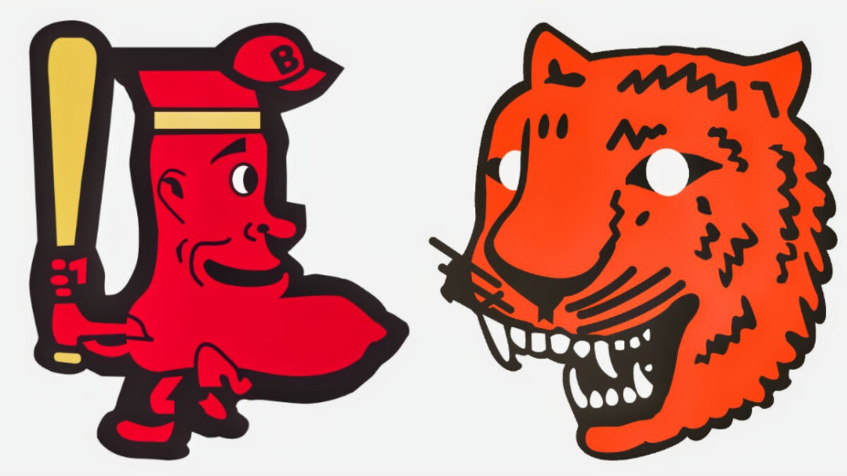
Every professional sports team has at least one logo that fans re not too proud of. But over the almost 150 years of Major League Baseball, we have seen some logos that are outright dumb. Here are the top ten dumbest logos in MLB history.
10. Mariners’ Primary Logo (87-92)
The Seattle Mariners are the MLB’s definition of “meh”. Their Primary Logo from 1987-1992 reaffirms this belief. The logo is just a baseball with “M’s” in it. What does the “M” stand for? Mets, or Mariners? Either way it looks like an alternate logo for “M&Ms” more than anything.
9. Pittsburgh Pirates Primary Logo (55-66)
The Pittsburg Pirate’s alternate logo looks like if Yosemite Sam joined Blackbeard to sail the seven seas and loot treasure, they found at Sea World. Admittedly, the Bandana that the pirate is wearing is cool, but the Pirate himself looks confused.
8. Texas Rangers Primary Logo 1994-2002
The one star in the middle of the Rangers’ logo from 94-2002 isn’t a logo. It’s a rating. The Dallas Cowboys did the star logo better. Also, the fact that their logo has the words “Texas Rangers baseball Club” in a circle around the logo seems kind of redundant.
Click on ‘Follow Us’ and get notified of the most viral MLB stories via Google! Follow Us
Like yeah, you’re a baseball club. Thank you for clarifying something we already know. In addition, the stripes going down the logo would give someone a headache from looking it for too long.
7. Cub’s Primary Logo 1918
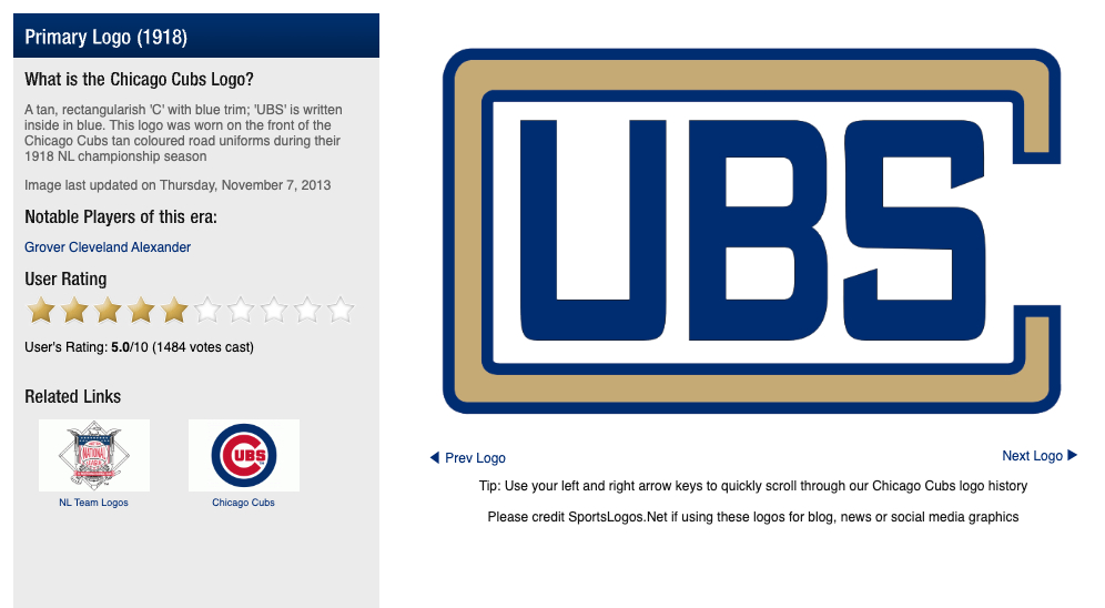
At first look, it’s hard to tell what the logo is supposed to be representing. It looks like a logo for “University of BS” which is ironically where any member of the Cub’s coaching staffs from 1945-2015 went to college.
The Blue letters in the logo don’t make sense, considering the Cubs’ uniforms did not contain any blue. The beige or gold, or whatever color the “C” is that goes around the rest of the letters looks like the logo’s border. All in all the logo is bland, confusing and hard to look at.
6. White Sox Primary Logo 1960-1975
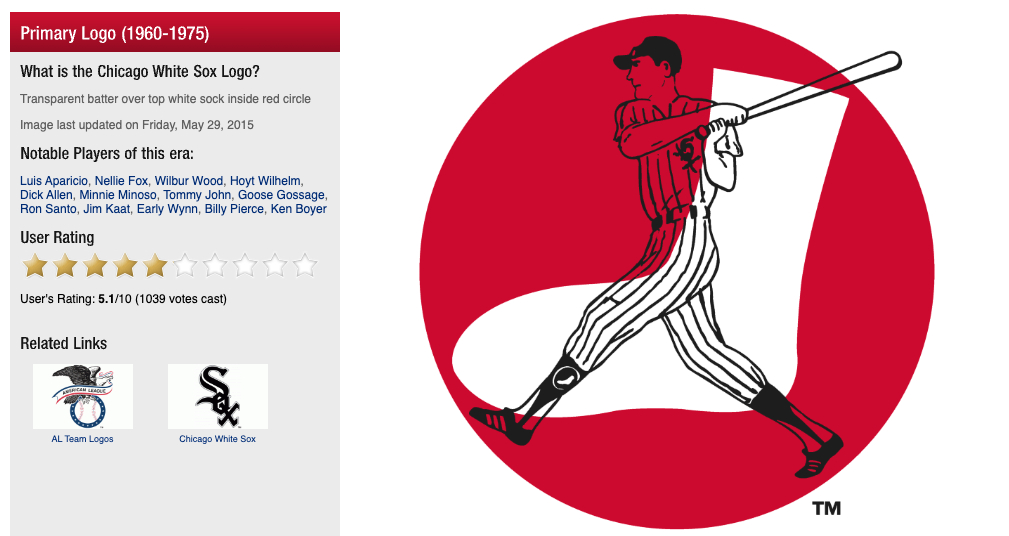
The white sock in the middle of a red background is honestly painful to look at. It’s almost as if the White Sox saw the Boston Red Sox logo had a red sock in the middle of a white background and then decided to flip it to make it their own.
Granted, the logo does have a cartoon picture of a White Sox player in the background which prevents the logo from being worse. Honestly without the player in the White Sox uniform, this logo could easily be mistaken for an alternate Red Sox logo.
5. Toronto Blue Jays’ Primary logo 2003
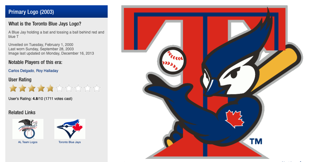
The Blue Jays’ 2003 logo looks like a Pokémon that was rejected because it was too scary to market to little kids. But the Bird in the logo does have a bigger bicep than Arnold Schwarzenegger, so he was clearly doing something right. The logo was used during the time that the “Steroid Era” was coming to an end in professional baseball, and it looks like the Blue Jay got a few cycles in himself before steroids completely went away.
4. Cleveland Indians’ and Guardians Primary Logo 2014-present
The “C” clearly doesn’t stand for “Creative”. The logo is boring and blocky. We “C” what the letter stands for, but we don’t “C” where it was a good idea to use .They straight up copied the Cincinnati Reds’ logo from 1900.
3. Cincinnati Reds’ Primary logo 1905, 1906-1907, 1908-1911
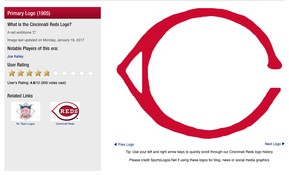
Okay, never mind everything that was just said about Cleveland’s logo. The Reds’ “C” looks like something scribbled on a piece of paper in a second-grade classroom. Also the little triangle in the left is meant to make the logo look unique but it just doesn’t add any character. In addition, the team’s next two versions of the classic “C” looks like something straight out of an Old English book. The Reds’ current logo is much better and more importantly doesn’t look like something that was scribbled in Microsoft Paint.
2. Detroit Tigers’ Primary logo: 1927-1928
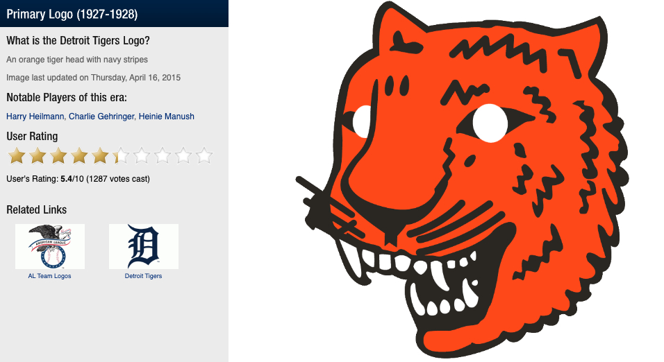
This logo is something that every man, woman, and child saw in their nightmares from 1927-1928. But hey, at least if Frosted Flakes every wants to rebrand Tony the Tiger into a horror villain they can always base him off of this logo. The white eyes make the tiger look possessed, and the whiskers on the tiger’s face give him a silly little mustache. All in all this is a silly logo, even for the 1920’s.
1. Boston Red Sox’ Alternate logo: 1950-59
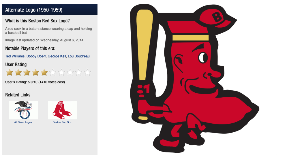
All of us here at Total Pro Sports will be checking our socks tonight before bed to make sure that they don’t turn into this monstrosity. The logo is supposed to be a cartoon sock that is playing baseball, which is funny in theory, but awful in execution.
The sock is wearing head band in addition to a hat that isn’t even fully on its head. Also, it is difficult to tell but the sock is giving a leg kick before it swings into a pitch. But worst of all the big chin on the sock is what really sells this as one of the worst logos in MLB History. The big chin on the Red Sox logo has to be exactly where the creators of Sponge Bob got the idea for Handsome Squidward.


